
Hello coders!! In this article, we will learn how to make a circle using matplotlib in Python. A circle is a figure of round shape with no corners. There are various ways in which one can plot a circle in matplotlib. Let us discuss them in detail.
Method 1: matplotlib.patches.Circle():
- SYNTAX:
- class
matplotlib.patches.Circle(xy, radius=r, **kwargs)
- class
- PARAMETERS:
- xy: (x,y) center of the circle
- r: radius of the circle
- RESULT: a circle of radius r with center at (x,y)
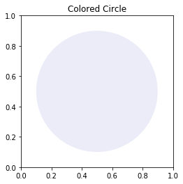
import matplotlib.pyplot as plt

figure, axes = plt.subplots()
cc = plt.Circle(( 0.5 , 0.5 ), 0.4 )

axes.set_aspect( 1 )
axes.add_artist( cc )
plt.title( 'Colored Circle' )
plt.show()
Output & Explanation:
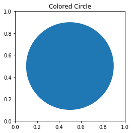
Here, we have used the circle() method of the matplotlib module to draw the circle. We adjusted the ratio of y unit to x unit using the set_aspect() method. We set the radius of the circle as 0.4 and made the coordinate (0.5,0.5) as the center of the circle.
Method 2: Using the equation of circle:
The equation of circle is:
- x = r cos θ
- y = r sin θ
r: radius of the circle
This equation can be used to draw the circle using matplotlib.
import numpy as np
import matplotlib.pyplot as plt

angle = np.linspace( 0 , 2 * np.pi , 150 )

radius = 0.4

x = radius * np.cos( angle )
y = radius * np.sin( angle )

figure, axes = plt.subplots( 1 )

axes.plot( x, y )
axes.set_aspect( 1 )

plt.title( 'Parametric Equation Circle' )
plt.show()
Output & Explanation:
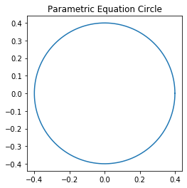
In this example, we used the parametric equation of the circle to plot the figure using matplotlib. For this example, we took the radius of the circle as 0.4 and set the aspect ratio as 1.
Method 3: Scatter Plot to plot a circle:
A scatter plot is a graphical representation that makes use of dots to represent values of the two numeric values. Each dot on the xy axis indicates value for an individual data point.
- SYNTAX:
matplotlib.pyplot.scatter(x_axis_data, y_axis_data, s=None, c=None, marker=None, cmap=None, vmin=None, vmax=None, alpha=None, linewidths=None, edgecolors=None)
- PARAMETERS:
- x_axis_data- x-axis data
- y_axis_data- y-axis data
- s- marker size
- c- color of sequence of colors for markers
- marker- marker style
- cmap- cmap name
- linewidths- width of marker border
- edgecolor- marker border-color
- alpha- blending value
import matplotlib.pyplot as plt

plt.scatter( 0 , 0 , s = 7000 )

plt.xlim( -0.85 , 0.85 )
plt.ylim( -0.95 , 0.95 )

plt.title( "Scatter plot of points Circle" )
plt.show()
Output & Explanation:
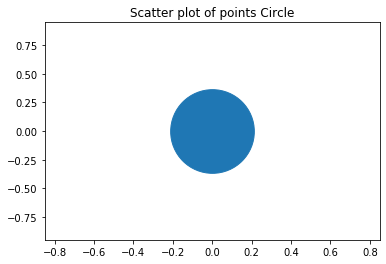
Here, we have used the scatter plot to draw the circle. The xlim() and the ylim() methods are used to set the x limits and the y limits of the axes respectively. We’ve set the marker size as 7000 and got the circle as the output.
Method 4: Matplotlib hollow circle:
import matplotlib.pyplot as plt

plt.scatter( 0 , 0 , s=10000 ,  facecolors='none', edgecolors='blue' )

plt.xlim( -0.5 , 0.5 )
plt.ylim( -0.5 , 0.5 )

plt.show()
Output & Explanation:
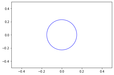
To make the circle hollow, we have set the facecolor parameter as none, so that the circle is hollow. To differentiate the circle from the plane we have set the edgecolor as blue for better visualization.
Method 5: Matplotlib draw circle on image:
import matplotlib.pyplot as plt
import matplotlib.patches as patches
import matplotlib.cbook as cb


with cb.get_sample_data('C:\\Users\\Prachee\\Desktop\\cds\\img1.jpg') as image_file:
    image = plt.imread(image_file)

fig, ax = plt.subplots()
im = ax.imshow(image)
patch = patches.Circle((100, 100), radius=80, transform=ax.transData)
im.set_clip_path(patch)

ax.axis('off')
plt.show()
Output & Explanation:

In this example, we first loaded our data and then used the axes.imshow() method. This method is used to display data as an image. We then set the radius and the center of the circle. Then using the set_clip_path() method we set the artist’s clip-path.
Method 6: Matplotlib transparent circle:
import matplotlib.pyplot as plt

figure, axes = plt.subplots()
cc = plt.Circle(( 0.5 , 0.5 ), 0.4 , alpha=0.1)

axes.set_aspect( 1 )
axes.add_artist( cc )
plt.title( 'Colored Circle' )
plt.show()
Output & Explanation:
To make the circle transparent we changed the value of the alpha parameter which is used to control the transparency of our figure.
Conclusion:
With this, we come to an end with this article. These are the various ways in which one can plot a circle using matplotlib in Python.
However, if you have any doubts or questions, do let me know in the comment section below. I will try to help you as soon as possible.
Happy Pythoning!
I using the example in the book Python Machine Learning by Sebastian Raschkla. In Chapter 3 page 89 there are examples creating circles around the plots to identify as test sets. I am not sure I think I have a new version of matplotlib v3.4.2, other students are using versions 3.3.2 & 3.3.4. the error I am getting is
from matplotlib.colors import ListedColormap
import matplotlib.pyplot as plt
def plot_decision_regions(X, y, classifier, test_idx=None, resolution=0.02):
# setup marker generator and color map
markers = (‘s’, ‘x’, ‘o’, ‘^’, ‘v’)
colors = (‘red’, ‘blue’, ‘lightgreen’, ‘gray’, ‘cyan’)
cmap = ListedColormap(colors[:len(np.unique(y))])
# plot the decision surface
x1_min, x1_max = X[:, 0].min() – 1, X[:, 0].max() + 1
x2_min, x2_max = X[:, 1].min() – 1, X[:, 1].max() + 1
xx1, xx2 = np.meshgrid(np.arange(x1_min, x1_max, resolution),
np.arange(x2_min, x2_max, resolution))
Z = classifier.predict(np.array([xx1.ravel(), xx2.ravel()]).T)
Z = Z.reshape(xx1.shape)
plt.contourf(xx1, xx2, Z, alpha=0.3, cmap=cmap)
plt.xlim(xx1.min(), xx1.max())
plt.ylim(xx2.min(), xx2.max())
for idx, cl in enumerate(np.unique(y)):
plt.scatter(x=X[y == cl, 0],
y=X[y == cl, 1],
alpha=0.8,
c=colors[idx],
marker=markers[idx],
label=cl,
edgecolor=’black’)
# highlight test examples
if test_idx:
# plot all examples
X_test, y_test = X[test_idx, :], y[test_idx]
plt.scatter(X_test[:, 0],
X_test[:, 1],
c=”,
edgecolor=’black’,
alpha=1.0,
linewidth=1,
marker=’o’,
s=100,
label=’test set’)
X_combined_std = np.vstack((X_train_std, X_test_std))
y_combined = np.hstack((y_train, y_test))
plot_decision_regions(X=X_combined_std, y=y_combined,
classifier=ppn, test_idx=range(105, 150))
plt.xlabel(‘petal length [standardized]’)
plt.ylabel(‘petal width [standardized]’)
plt.legend(loc=’upper left’)
plt.tight_layout()
plt.show()
Can you print out what is
colorsandcolors[idx]and let me know here?