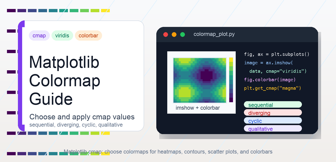
Quick answer: Choose a Matplotlib colormap by data meaning: sequential for ordered magnitude, diverging for a meaningful midpoint, cyclic for wraparound quantities, and qualitative for categories. Pair cmap with explicit normalization and a colorbar.
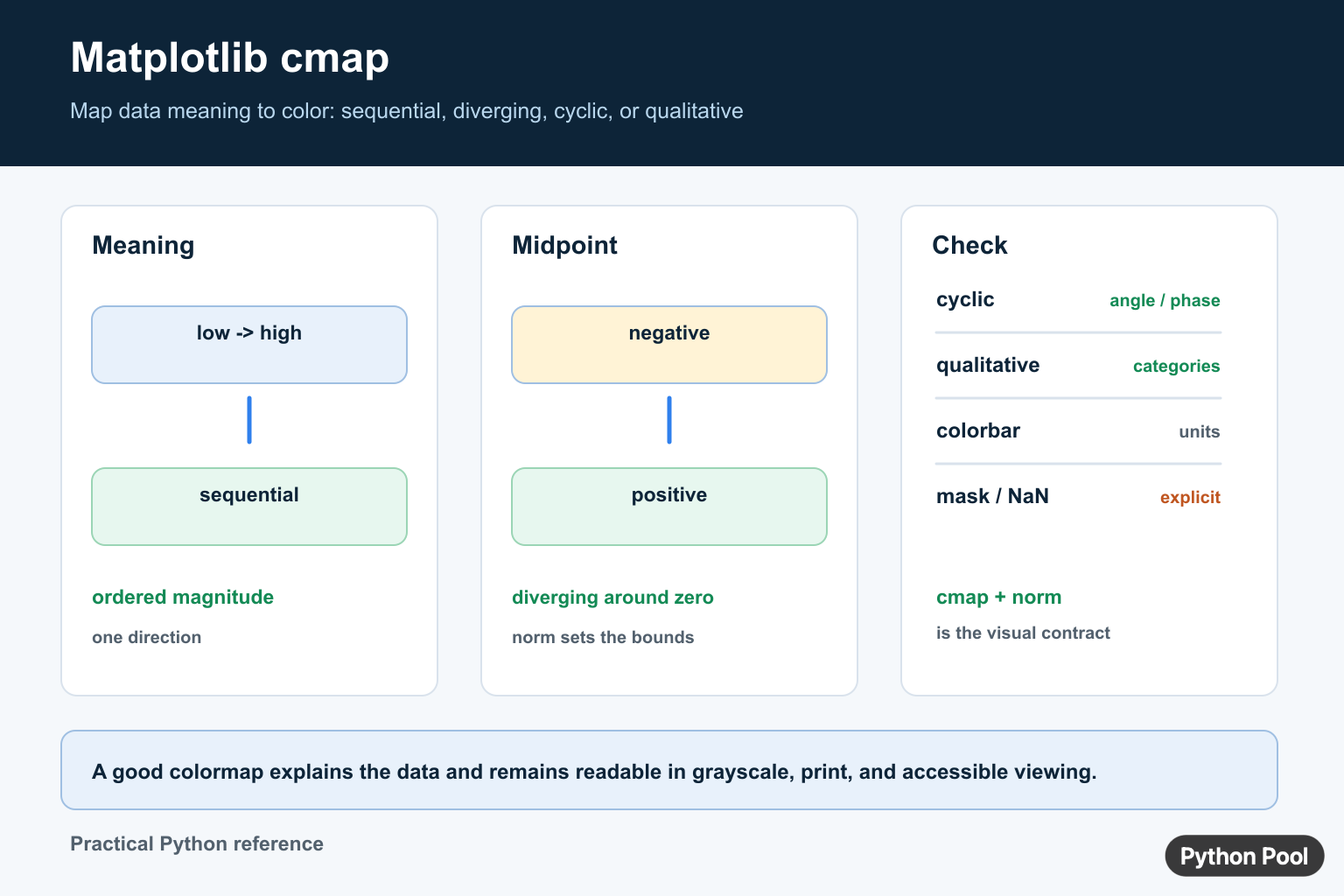
Matplotlib cmap is the colormap setting used to map numeric values to colors. It appears in plotting functions such as imshow(), scatter(), contourf(), and pcolormesh(). Choosing the right colormap makes a plot easier to read; choosing the wrong one can hide patterns or exaggerate differences.
The common pattern is to pass a colormap name with cmap="viridis", then add a colorbar when the colors represent numeric values. viridis is a good default for many sequential datasets because it is perceptually uniform and readable in grayscale compared with older rainbow-style maps.
Basic cmap example with imshow()
Use cmap when plotting a 2D array. A colorbar explains what the colors mean.
import matplotlib.pyplot as plt

fig, ax = plt.subplots()
image = ax.imshow(data, cmap="viridis")
fig.colorbar(image, ax=ax, label="value")

ax.set_title("Heatmap with viridis")
fig.savefig("heatmap.png", dpi=200)
This same pattern applies to heatmaps and image-like arrays. If you are building a heatmap specifically, the PythonPool guide to Matplotlib heatmap is a useful next step. If the data comes from an image file, see Matplotlib imread.
Use cmap with scatter plots
In a scatter plot, c supplies the numeric values and cmap controls how those values become colors.
scatter = ax.scatter(x, y, c=values, cmap="plasma")
fig.colorbar(scatter, ax=ax, label="value")
Use this when marker position and marker color both encode information. The colorbar should describe the color variable, not the x or y axis. If color-coded elements overlap, layer order can matter; Matplotlib zorder covers that control.
Use cmap with contourf()
Filled contour plots often depend heavily on colormap choice. Sequential colormaps work for values that move from low to high. Diverging colormaps work better when a meaningful center value, often zero, separates low and high extremes.
filled = ax.contourf(X, Y, Z, levels=20, cmap="RdBu_r")
fig.colorbar(filled, ax=ax)
The _r suffix reverses many built-in colormaps, so RdBu_r is the reversed version of RdBu. For more examples with filled contours, see Matplotlib contourf(). For rectangular grid cells instead of smooth filled contours, compare Matplotlib pcolormesh.
Main colormap categories
Matplotlib groups colormaps by how they should be interpreted. Pick the category first, then choose a specific colormap.
| Category | Use when | Examples |
|---|---|---|
| Sequential | Values move from low to high | viridis, plasma, magma, cividis |
| Diverging | A center value matters | RdBu, coolwarm, seismic |
| Cyclic | Values wrap around | twilight, hsv |
| Qualitative | Categories have no numeric order | tab10, Set2, Accent |
A sequential colormap is usually the safest default for magnitudes, counts, intensity, or density. A diverging colormap is better for positive and negative deviation around a baseline. A qualitative colormap should not be used for continuous numeric gradients because the color jumps imply categories.
Get and reverse colormaps
You can retrieve a colormap object with plt.get_cmap(). Add _r to many built-in colormap names to reverse them.
cmap = plt.get_cmap("magma")
reversed_cmap = plt.get_cmap("magma_r")
Use reversed colormaps when the semantic direction should change. For example, a dark-to-light map may work better for one background, while the reversed version may work better on another.
Set a default colormap
plt.set_cmap() sets the default colormap for the current image-style plots. In reusable scripts, passing cmap directly to each plotting call is usually clearer because the setting is local and easy to inspect.
plt.set_cmap("cividis")Use global defaults carefully in notebooks because later cells may inherit the setting. Local arguments make examples easier to copy and debug.
Transparency and normalization
Colormaps decide the colors, while normalization decides how data values are mapped into the 0 to 1 range used by the colormap. If the plot looks washed out or overly saturated, the issue may be normalization rather than the colormap itself. Matplotlib supports logarithmic and custom normalization for values with uneven ranges.
Transparency is usually handled by the artist, such as alpha=0.7, or by building a custom colormap. For most everyday plots, start with a built-in colormap and simple alpha settings. If the background itself needs styling, see Matplotlib background color. If you are exporting the result, use the refreshed Matplotlib savefig() guide.
Common cmap mistakes
Do not use a qualitative colormap for ordered numeric values. Do not omit the colorbar when color carries numeric meaning. Do not use a diverging colormap unless the center value has real meaning. Do not rely on the old jet colormap for scientific interpretation; it can create visual boundaries that are not present in the data.
For plot readability, combine the colormap with clear labels, reasonable limits, and a colorbar. Axis grids can help some charts, but they are separate from colormap design; see Matplotlib grid for that styling layer. For a direct colorbar walkthrough, see Matplotlib colorbar.
Official Matplotlib references
- Matplotlib colormap guide
- Matplotlib colormap API
- pyplot.get_cmap documentation
- pyplot.set_cmap documentation
- pyplot.imshow documentation
- pyplot.scatter documentation
- pyplot.colorbar documentation
- Colormap normalization guide
Match cmap To Data Semantics
A colormap is part of the data explanation, not merely decoration. Use sequential maps for values that increase from meaningful low to high, diverging maps when a central value such as zero matters, cyclic maps for angles or phases, and qualitative palettes for categories with no numeric order.
import matplotlib.pyplot as plt
import numpy as np

values = np.array([[-2, -1, 0], [1, 2, 3]])
fig, ax = plt.subplots()
image = ax.imshow(values, cmap="coolwarm", vmin=-3, vmax=3)
fig.colorbar(image, ax=ax, label="Deviation")
ax.set_title("Diverging data around zero")
fig.tight_layout()
Separate cmap From norm
cmap chooses colors, while normalization maps data values into the colormap interval. Share a Normalize instance or fixed bounds when several plots must be comparable. Automatic bounds per subplot can make identical values appear with different colors.
Test Accessibility And Missing Data
Check the figure in grayscale, with a color-vision deficiency simulator, and at the final export size. A colorbar should include units or a meaningful label. Define how masked, NaN, out-of-range, and categorical values are represented rather than letting a default color silently carry a claim.
Frequently Asked Questions
What does cmap mean in Matplotlib?
cmap selects the colormap that maps normalized data values to colors in artists such as imshow, scatter, and contour plots.
Which Matplotlib colormap should I use?
Use sequential for ordered magnitude, diverging for a meaningful midpoint, cyclic for wraparound values, and qualitative for unordered categories.
What is the difference between cmap and norm?
cmap chooses the colors, while norm maps data values into the interval used by the colormap.
How do I make colormaps comparable across plots?
Use shared normalization bounds or a shared Normalize object, then add a labeled colorbar and define the treatment of masked or missing values.