Hello programmers, in today’s article, we will learn about the Matplotlib Logscale in Python. Matplotlib log scale is a scale having powers of 10. You could use any base, like 2, or the natural logarithm value is given by the number e. Using different bases would narrow or widen the spacing of the plotted elements, making visibility easier. We can use the Matlplotlib log scale for plotting axes, histograms, 3D plots, etc. Let’s take a look at different examples and implementations of the log scale.
Logarithmic Scales are a very important data visualization technique. This scale allows us to witness the exponential growth of a system on a linear scale. For example, the cases of Novel Corona Virus are increasing in an exponential manner, In such cases, using log scales helps you to check the control of the virus.
Changing y-axis to Matplotlib log scale
from matplotlib import pyplot

# Create a subplot to show the graph
pyplot.subplot(1, 1, 1)

# Powers of 10
a = [10**i for i in range(10)]
# Plotting the graph
pyplot.plot(a, color='blue', lw=2)
# Setting a logarithmic scale for y-axis
pyplot.yscale('log')
pyplot.show()
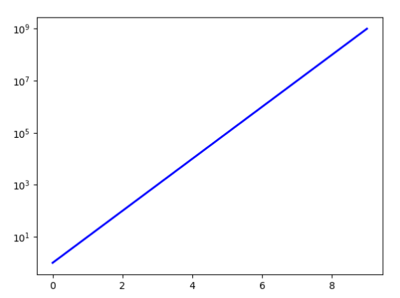
Output:
Explanation:
The process of plot logarithmic axes is similar to regular plotting, except for one line of code specifying the type of axes as ‘log.’ In the above example, we first set up the subplot required plot the graph. We will then plot the powers of 10 against their exponents. This is a linear, logarithmic graph. Without the logarithmic scale, the data plotted would show a curve with an exponential rise. Thus to obtain the y-axis in log scale, we will have to pass ‘log’ as an argument to the pyplot.yscale(). Similarly, you can apply the same to change the x-axis to log scale by using pyplot.xscale(‘log’)
Matplotlib Log Scale Using Semilogx() or Semilogy() functions
import pandas as pd
import matplotlib.pyplot as plt

x = [10, 100, 1000, 10000, 100000]
y = [2, 4 ,8, 16, 32]

fig = plt.figure(figsize=(8, 6))
plt.scatter(x,y)
plt.plot(x,y)
plt.grid()

plt.semilogx()
plt.semilogy(basey=2)

plt.xlabel("x",fontsize=20)
plt.ylabel("y",fontsize=20)

plt.show()
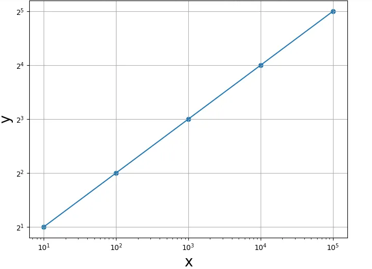
Output:
Explanation:
The semilogx() function is another method of creating a plot with log scaling along the X-axis. While the semilogy() function creates a plot with log scaling along Y-axis. The default base of the logarithm is 10. We can, however, set the base with basex and basey parameters for the function semilogx() and semilogy(), respectively. In the above example, the plt.semilogx() function with default base 10 is used to change the x-axis to a logarithmic scale. While the plt.semilogy() function changes the y-axis to base 2 log scale.
Matplotlib Log Scale Using loglog() function
import pandas as pd
import matplotlib.pyplot as plt

x = [10, 100, 1000, 10000, 100000]
y = [2, 4 ,8, 16, 32]

fig = plt.figure(figsize=(8, 6))
plt.scatter(x,y)
plt.plot(x,y)

plt.loglog(basex=10,basey=2)

plt.show()
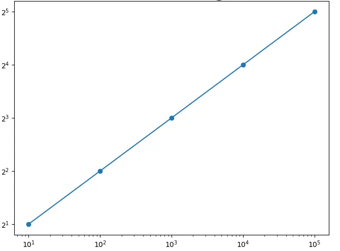
Output:
Explanation:
We can also implement log scaling along both X and Y axes by using the loglog() function. The base of the logarithm for the X-axis and Y-axis is set by basex and basey parameters. In the above example, basex = 10 and basey = 2 is passed as arguments to the plt.loglog() function which returns the base 10 log scaling x-axis. And base 2 log scaling along the y-axis.
Scatter plot with Matplotlib log scale in Python
import matplotlib.pyplot as plt
import numpy as np
f, ax = plt.subplots()
ax.set_xscale('log')
ax.set_yscale('log')
ax.scatter(2**np.arange(10), 2**np.arange(10))
Output:
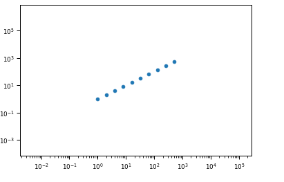
Explanation:
In the above example, the axes are the first log scaled, bypassing ‘log’ as a parameter to the ser_xscale() and set_yscale() functions. The plt.scatter() function is then called, which returns the scatter plot on a logarithmic scale. The margins of the plot are huge. However, if the plt.scatter() method is used before log scaling the axes, the scatter plot appears normal.
Matplotlib logscale Histogram Plot
import pandas as pd
import numpy as np
import matplotlib.pyplot as plt

x = [2, 1, 76, 140, 286, 267, 60, 271, 5, 13, 9, 76, 77, 6, 2, 27, 22, 1, 12, 7,
     19, 81, 11, 173, 13, 7, 16, 19, 23, 197, 167, 1]
x = pd.Series(x)

# histogram on linear scale
plt.subplot(211)
hist, bins, _ = plt.hist(x, bins=8)

# histogram on log scale.
# Use non-equal bin sizes, such that they look equal on log scale.
logbins = np.logspace(np.log10(bins[0]),np.log10(bins[-1]),len(bins))
plt.subplot(212)
plt.hist(x, bins=logbins)
plt.xscale('log')
plt.show()
Output:
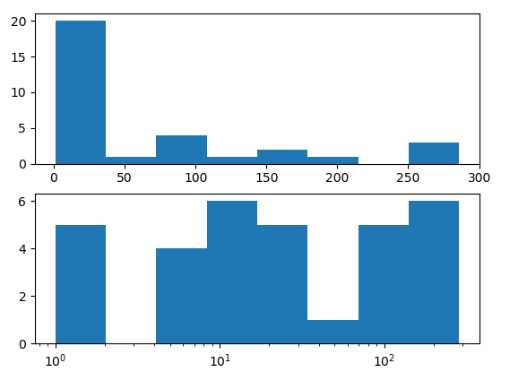
Explanation:
In the above example, the Histogram plot is once made on a normal scale. And also plotted on Matplotlib log scale. For plotting histogram on a logarithmic scale, the bins are defined as ‘logbins.’ Also, we use non-equal bin sizes, such that they look equal on a log scale. The x-axis is log scaled, bypassing ‘log’ as an argument to the plt.xscale() function.
How to Plot Negative Values on Matplotlib Logscale?
Sometimes, your data contains both positive and negative values. In such scenarios, the log scale won’t work since log values of negative numbers doesnt exists. In such cases, we have couple of options to follow –
- Shift the origin to the lowest value of the dataset. This means the lowest value in your dataset will become 0 and every other value will be increased by the absolute of your lowest value. arr = arr + min(arr) will give you the non negative values.
- Using Symmetric Log Scale. This scale will value both sides of 0. Use plt.yscale(‘symlog’) to apply a symmetric log scale on the yaxis.
Conclusion:
In this article, we have discussed various ways of changing into a logarithmic scale using the Matplotlib logscale in Python. We have seen different functions to implement log scaling to axes. Like semilogx() or semilogy() functions and loglog() functions. We also cited examples of using Matplotlib logscale to plot to scatter plots and histograms. Refer to this article in case of any queries regarding the use of Matplotlib Logscale.
However, if you have any doubts or questions, do let me know in the comment section below. I will try to help you as soon as possible.
Happy Pythoning!
Thank you very much, buddy!
I’m glad you liked it!
Regards,
Pratik
using log scale doesn’t work for 3d plots
No, you can do it for 3d plots too. Just set the scale for all 3 axes –
ax.xaxis.set_scale(‘log’)
ax.yaxis.set_scale(‘log’)
ax.zaxis.set_scale(‘log’)