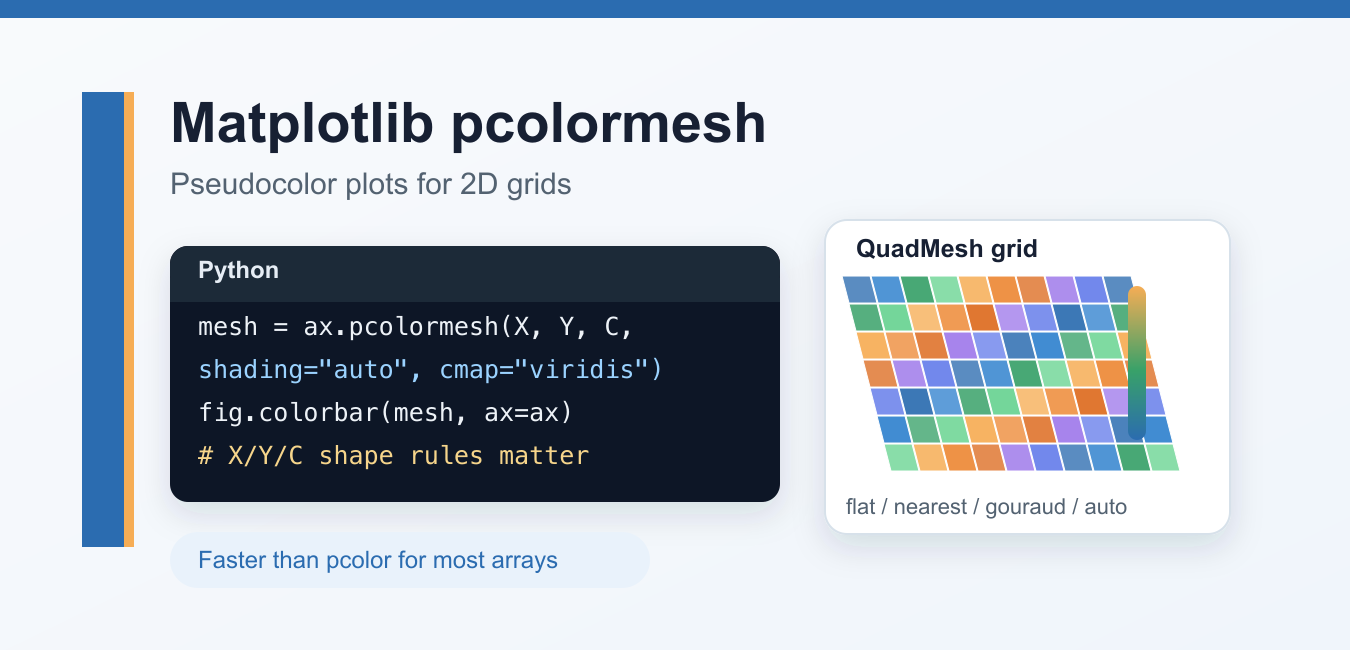
matplotlib.pyplot.pcolormesh() creates a pseudocolor plot from a 2D value array. It is useful for heatmaps, scientific fields, and gridded measurements where the x and y coordinates matter. Unlike a simple image display, pcolormesh() can represent non-uniform rectangular coordinates and gives explicit control over how cells receive colors.
Quick answer
Start with ax.pcolormesh(X, Y, C, shading="auto"), where C contains the values and X and Y define the grid. For shading="flat", the coordinate dimensions are one larger than C because they describe cell corners. For shading="nearest" or "gouraud", the coordinate dimensions match C. Add the returned mesh to fig.colorbar().
The Matplotlib pcolormesh reference documents the X, Y, and C shape rules, while the pcolormesh grids example shows how shading changes the interpretation of coordinates. Use the object-oriented Axes method for maintainable figures.
Basic pcolormesh example
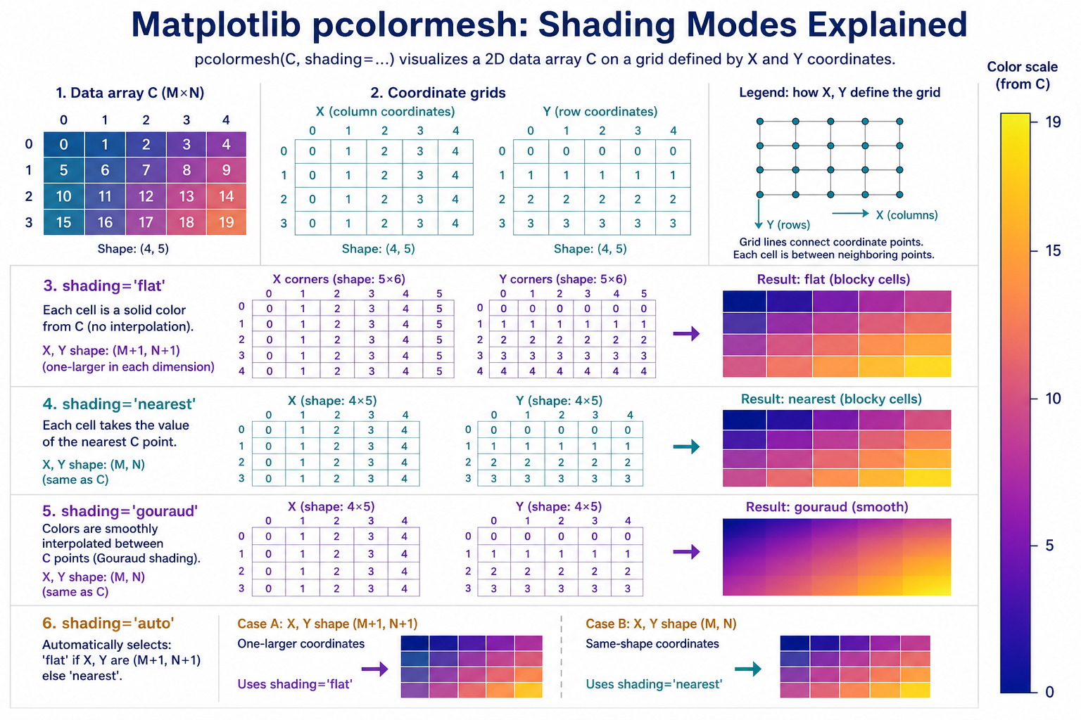
Create a grid, calculate one value for each point, and store the returned QuadMesh so the colorbar uses the same normalization.
import numpy as np
import matplotlib.pyplot as plt

x = np.linspace(-3, 3, 80)
y = np.linspace(-2, 2, 60)
X, Y = np.meshgrid(x, y)
Z = np.sin(X**2 + Y**2)

fig, ax = plt.subplots()
mesh = ax.pcolormesh(X, Y, Z, shading="auto", cmap="viridis")
fig.colorbar(mesh, ax=ax, label="value")
ax.set_title("pcolormesh example")
plt.show()
shading="auto" is a practical default because Matplotlib chooses a compatible interpretation from the coordinate shapes. When you need a specific cell model, set the shading mode explicitly and verify the dimensions.
Understand X, Y, and C shapes
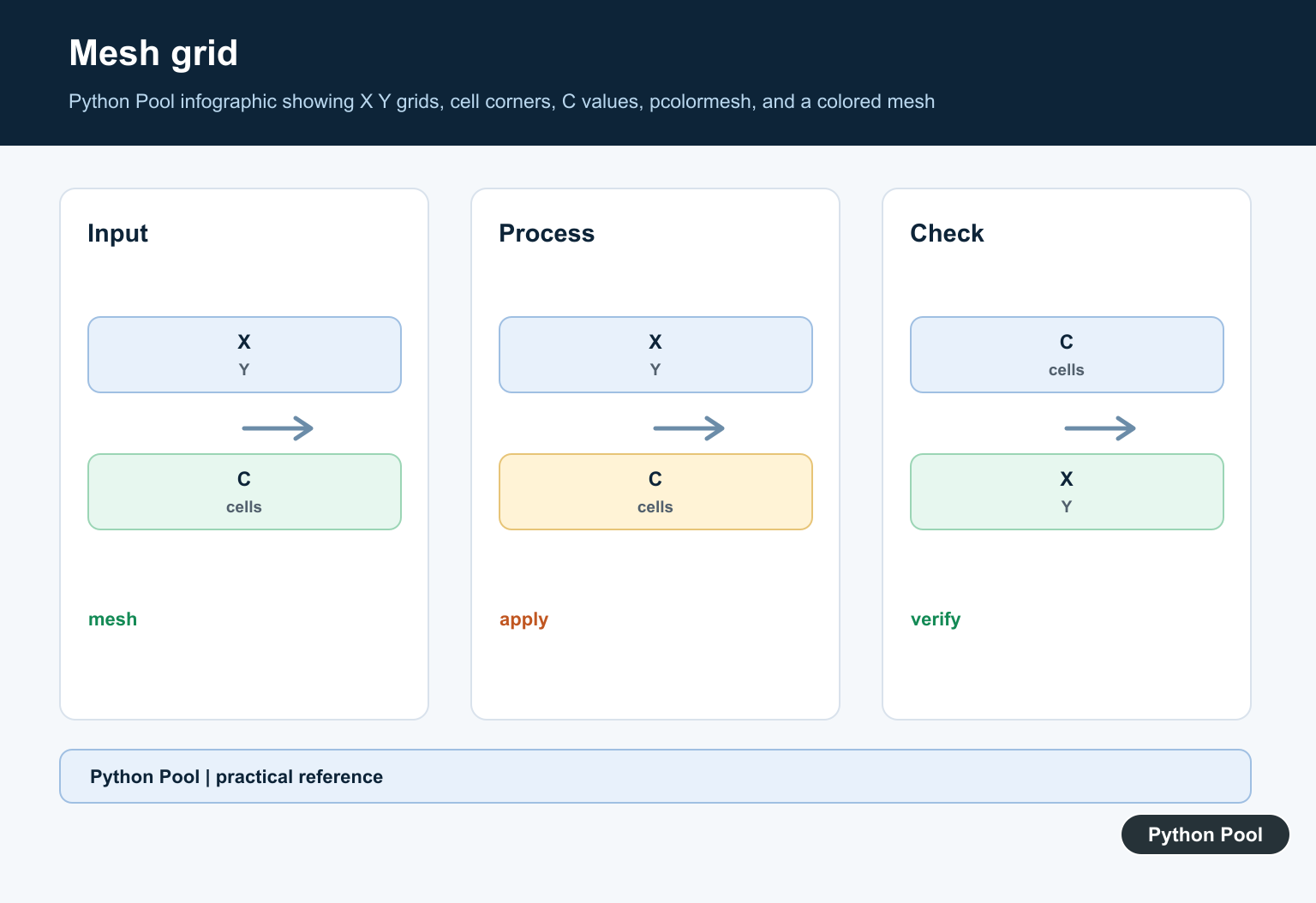
If C has shape (M, N), flat shading expects x and y corner coordinates with shape (M+1, N+1). Nearest and Gouraud shading use coordinates with shape (M, N). One-dimensional x and y arrays can be expanded into a rectangular grid.
import numpy as np

C = np.arange(15).reshape(3, 5)
print(C.shape)

x_edges = np.arange(6)
y_edges = np.arange(4)
print(x_edges.shape)
print(y_edges.shape)
Shape errors are usually more useful than they look. Compare each dimension instead of changing array sizes blindly. Ask whether your coordinates describe cell corners or cell centers.
Use flat shading for cell corners
Flat shading gives each quadrilateral one solid color from the corresponding entry in C. The coordinate arrays describe the edges around those cells.
import numpy as np
import matplotlib.pyplot as plt

C = np.arange(15).reshape(3, 5)
x = np.arange(6)
y = np.arange(4)

fig, ax = plt.subplots()
mesh = ax.pcolormesh(x, y, C, shading="flat", cmap="plasma")
fig.colorbar(mesh, ax=ax)
plt.show()
This mode is a good fit when measurements are attached to rectangular cells, such as bins or finite-volume regions. The extra coordinate is not an arbitrary padding value; it closes the final boundary.
Use nearest shading for same-shape grid points
Nearest shading centers each color around its matching coordinate point. The X, Y, and C arrays must have the same shape.
import numpy as np
import matplotlib.pyplot as plt

x = np.arange(5)
y = np.arange(3)
X, Y = np.meshgrid(x, y)
C = X + Y

fig, ax = plt.subplots()
mesh = ax.pcolormesh(X, Y, C, shading="nearest", cmap="magma")
fig.colorbar(mesh, ax=ax)
plt.show()
Use this interpretation when each value belongs to a known grid point rather than the space between corner coordinates. It is different from simply resizing an image.
Use Gouraud shading for interpolation
Gouraud shading interpolates colors between neighboring grid points and can produce a smooth visual transition. It still requires X, Y, and C to have matching dimensions.
import numpy as np
import matplotlib.pyplot as plt

x = np.linspace(-2, 2, 80)
y = np.linspace(-2, 2, 80)
X, Y = np.meshgrid(x, y)
C = np.exp(-(X**2 + Y**2))

fig, ax = plt.subplots()
mesh = ax.pcolormesh(X, Y, C, shading="gouraud", cmap="viridis")
fig.colorbar(mesh, ax=ax)
plt.show()
Smooth rendering does not add information to the data. Use it when interpolation is an honest visual representation, not when a rough grid needs to look more precise.
Plot a non-uniform grid
One advantage over imshow() is that x and y spacing can be uneven. This matters when the coordinate system is not a regular image grid.
import numpy as np
import matplotlib.pyplot as plt

x = np.array([-3, -2, -1.4, -0.7, -0.2, 0.4, 1.2, 2.4, 3.0])
y = np.linspace(-2, 2, 60)
X, Y = np.meshgrid(x, y)
Z = np.cos(X) * np.sin(Y)

fig, ax = plt.subplots()
mesh = ax.pcolormesh(X, Y, Z, shading="auto", cmap="coolwarm")
fig.colorbar(mesh, ax=ax)
plt.show()
Choose imshow() when the data is an evenly spaced image-like array and explicit coordinates do not matter. Choose pcolormesh() when the grid geometry is part of the meaning.
Control colors and the colorbar
The cmap argument selects a colormap. vmin and vmax control the numeric range mapped to that colormap, which is important when comparing several panels.
mesh = ax.pcolormesh(
    X,
    Y,
    Z,
    shading="auto",
    cmap="viridis",
    vmin=-1,
    vmax=1,
)
fig.colorbar(mesh, ax=ax, label="normalized value")
Use a shared normalization when separate plots must be comparable. A colorbar without the returned mesh can accidentally use a different object or fail to communicate the data range.
Common mistakes
- Passing corner coordinates with same-shape data while using flat shading.
- Assuming nearest shading describes cell corners.
- Forgetting the colorbar or using a different mesh for it.
- Using imshow when the x and y spacing is non-uniform.
- Using smooth shading to imply precision the measurements do not have.
The practical workflow is to identify what each value represents, choose corner or center coordinates, check the shapes, then choose the shading mode. With that model clear, most pcolormesh errors become straightforward shape corrections rather than trial and error.
Use the Axes API and layout carefully
The Axes method keeps a figure’s data and formatting in one object, which is especially useful when a page contains several heatmaps. Set axis labels, limits, and a title on the same Axes that owns the mesh. Let the figure manage the colorbar so its size and position stay aligned with the plot.
For a report or article, choose a figure size that leaves room for the colorbar and long tick labels. Apply a layout method after adding the colorbar and inspect the result at the final display size. A technically correct mesh can still be unreadable if labels or the scale are clipped.
Mask missing grid values
If some C values are invalid, use a masked array or a documented replacement rather than drawing misleading colors. Check how the chosen colormap represents bad values and explain the missing-data convention in the caption. This is particularly important for scientific fields where a blank cell and a zero cell mean different things.
Save the returned mesh when you need consistent normalization across panels. Reusing one value range makes visual comparisons meaningful; allowing each panel to autoscale can make identical values appear to have different importance.
For matrix-style plots, compare pcolormesh with colorbars and imshow(). Read matplotlib colorbar and matplotlib imshow for the related workflow.
Frequently Asked Questions
Frequently Asked Questions
What is pcolormesh used for?
pcolormesh creates pseudocolor plots from a 2D value array and is especially useful when x and y grid coordinates are explicit or non-uniform.
What shape does pcolormesh need?
For flat shading, X and Y are one larger than C in each dimension. For nearest and gouraud, X, Y, and C have matching shapes.
What does shading auto do?
shading=’auto’ chooses flat when the coordinate arrays are one larger than C and nearest when they have the same shape.
What is the difference between pcolormesh and imshow?
pcolormesh can represent explicit and uneven grid coordinates, while imshow is simpler for regular image-like arrays.