A histogram is commonly used to plot frequency distributions from a given dataset. Whenever we have numerical data, we use histograms to give an approximate distribution of that data. It shows how often a given value occurs in a given dataset. Matplotlib 2D Histogram is used to study the frequency variation of a given parameter with time.
We use 2D histograms when in a given dataset, the data is distributed discretely. As a result, we only want to determine where the frequency of the variable distribution is more among the dense distribution. There is a predefined function ‘matplotlib.pyplot.hist2d()’ present in python . It is present in the matplotlib library in python and is used to plot the matplotlib 2D histogram.
Matplotlib Library
Matlplotlib is a library in python which is used for data visualization and plotting graphs. It helps in making 2D plots from arrays. The plots help in understanding trends, discovering patterns, and find relationships between data. We can plot several different types of graphs. The common ones are line plots, bar plots, scatter plots and histograms.
What is a Histogram in ‘Matplotlib 2D Histogram’ ?
Histograms are frequency distribution graphs. From a continuous dataset, a histogram will tell about the underlying distribution of data. It highlights various characteristics of data such as outliers in a dataset, imbalance in data, etc. We split the data into intervals, and each interval signifies a time period. It is not the height but the area covered by the histogram, which denotes frequency. To calculate frequency, we need to multiply the width of the histogram by its height.
Parameters:
x: is a vector containing the ‘x’ co-ordinates of the graph.
y: is a vector containing the ‘y’ co-ordinates of the graph.
bins: is the number of bins/bars in the histogram.
range: is the leftmost and rightmost edge for each bin for each dimension. The values occurring outside this range will be considered as outliers.
density: is a boolean variable that is false by default, and if set to true, it returns the probability density function.
weights: is an optional parameter which is an array of values weighing each sample.
cmin is an optional scalar value that is None by default. Thus, the bins whose count is less than cmin value would not be displayed.
cmax is an optional scalar value that is None by default. The bins whose count is greater than cmax value would not be displayed.
Return values
h: A 2D array where the x values are plotted along the first dimension and y values are plotted along the second dimension.
xedges is a 1D array along the x-axis
yedges is a 1D array along the y axis
image is the plotted histogram
Example Matplotlib 2D Histogram:
Here, we shall consider a height distribution scenario, and we will construct a histogram for the same.
Let us first create a height distribution for 100 people. We shall do this by using Normal Data Distribution in NumPy. We want the average height to be 160 and the standard deviation as 10.
First, we shall import numpy library.
import numpy as np
Now, we shall generate random values using random() function.
heights = np.random.normal(160, 10, 100)
Now, we shall plot the histogram using hist() function.
plt.hist(heights)

Also Read | Numpy histogram() Function With Plotting and Examples
Understanding the hist2d() function used in matplotlib 2D histogram
The hist2d() function comes into use while plotting two-dimensional histograms. The syntax for the hist2d() function is:
def hist2d(x, y, bins=10, range=None, density=False, weights=None, cmin=None, cmax=None, *, data=None, **kwargs)
2D Histograms
Unlike a 1D histogram, a 2D histogram is formed by a counting combination of values in x and y class intervals. 2D Histogram simplifies visualizing the areas where the frequency of variables is dense. In the matplotlib library, the function hist2d() is used to plot 2D histograms. It is a graphical technique of using squares of different color ratios. Here, each square groups its number into ranges. Higher the color ratio in 2D histograms, the higher the data that falls into that bin.
Let us generate 50 values randomly.
x = np.random.standard_normal(50)
y = x + 10
Now, we shall plot using hist2d() function.
plt.hist2d(x,y)

Now, we shall try to change the bin size.
x = np.random.standard_normal(1000000)
y = 3.0 * x + 2.0 * np.random.standard_normal(1000000)
plt.hist2d(x,y,bins=50)
The output would be:

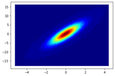
Now, we shall change the color map of the graph. The function hist2d() has parameter cmap for changing the color map of the graph.
plt.hist2d(x,y,bins=50,cmap=plt.cm.jet)

Another way to plot the 2d histogram is using hexbin. Instead of squares, a regular hexagon shape would be the plot in the axes. We use plt.hexbin() for that.
plt.hexbin(x,y,bins=50,cmap=plt.cm.jet)
The output after using hexbin() function is:
hist2d() vs hexbin() vs gaussian_kde()
hist2d() is a function used for constructing two dimensional histogram. It does it by plotting rectangular bins.
hexbin() is also a function used for constructing a two-dimensional histogram. But instead of rectangular bins, hexbin() plots hexagonal bins.
In gaussian_kde(), kde stands for kernel density estimation. It is used to estimate the probability density function for a random variable.
FAQ’s on matplotlib 2D histogram
Q. What are seaborn 2d histograms?
A. Seaborn is a Python data visualization library based on matplotlib. It provides a high-level interface for drawing statistical graphics. For example, we can plot histograms using the seaborn library.
Q. What are bins in histogram?
A. A histogram displays numerical data by grouping it into ‘bins’ of different widths. Each bin is plotted as a bar. And the area of the bar determines the frequency and density of the hat group.
Q. What is the difference between histogram and bar graph?
A. A bar graph helps in comparing different categories of data. At the same time, histogram helps in displaying the frequency of occurrence of data.
Have any doubts? Feel free to tell us in the comment section below.
Happy Learning!