We, humans, are great at understanding the visuals rather than going through numerical data. It becomes very easy for us to find insights from a graph, a pie chart, or any other visual. We make different types of graphs for different types of data. For example, if we have lots of data about the distribution of salary in a company, so will we will make a histogram. But if we have data on fruits and vegetables sold for the years 2015, 2016, 2017, we will make a bar chart.
Matplotlib Bar is a method in Python which allows you to plot traditional bar graphs. These bar graphs can be colorized, resized, and can be customized heavily. In today’s article, we will learn more about how to create a bar chart in python using the matplotlib bar function.
To better understand BarCharts, let us see how we can represent certain data in a bar chart.
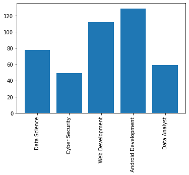
Suppose we have data on the number of students who study various technologies.
Technologies = [‘Data Science’, ‘Cyber Security’, ‘Web Development’, ‘Android Development’, ‘Data Analyst’]
No. Of students in these technologies = [78,49,112,129,59]
Syntax of Matplotlib Bar
To use matplotlib and its bar function, we must first install the matplotlib module using – pip install matplotlib.
The bar() is a function of pyplot submodule, we have to import pyplot submodule along with matplotlib module like this-
import matplotlib.pyplot
bar( x, height, width=0.8, bottom=None, align=’center’, **kwargs)
Parameters-
- X: In this parameter, we have to give the values to the x-axis. Like in the above example, we would list all the technologies in the ‘x’ parameter. The value can be a list or floating-point value.
- Height: In this parameter, we give the heights of the values on the x-axis. We can say that it is the y-axis of the graph.
- Width: Here, we can mention the width of each bar. By default, the value is 0.8. To make the bar thin, use values less than 0.8, and for the thicker bar, use values greater than 0.8.
- Bottom: In this parameter, we give the lowermost value, or you can say the starting value of the y-axis.
- Align: Here we tell where we want to start the names in x-axis from. By default, the value is ‘centre.’ Another option is ‘edge.’ We will understand it better using an example.
- Kwargs– In this parameter, we can use parameters like color, edge color, and many more.
Return Type:
This function returns a BARCONTAINER.
Making Bars in Python using Matplotlib Bar Function
Making our First Bar Graph in Python
Let us make the graph of the technologies vs. the number of students studying that technology.
# imporitng the pyplot submodule of matplotlib module and
# giving the alias/nickname as plt.
import matplotlib.pyplot as plt
# initializing the x-axis data
technologies=['Data Science', 'Cyber Security', 'Web Development', 'Android Development', 'Data Analyst']
# initializing the y-axis data
number_of_students=[78,49,112,129,59]
# Giving the bar function x axis as technologies
# and height as number_of_students
plt.bar(x=technologies,height=number_of_students)
# As the name of technologies are too long,
# let us rotate the title of x axis by 90 degree.
plt.xticks(rotation=90)
# without the plt.show(), the bar will not be created
plt.show()

How to change the colors of the bar and border-color
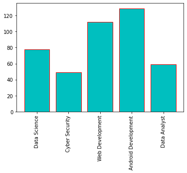
We can also change the color of the bar which is by default blue. We can either use color=’r’ or color=’red’. Also, we can add border color to make the bar more differentiable. We can also give the hex code values of particular values in the color parameter.
import matplotlib.pyplot as plt
technologies=['Data Science', 'Cyber Security', 'Web Development', 'Android Development', 'Data Analyst']
number_of_students=[78,49,112,129,59]
# Adding color and border-color using color and edge color parameters
plt.bar(x=technologies,height=number_of_students,color="#00FFFF",edgecolor="r")
plt.xticks(rotation=90)
# without the plt.show(), the bar will not be created
plt.show()
How to build multi-column bar graphs
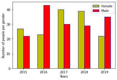
Multiple bar charts in the same graphs are generally used when we have to compare two or more types. Like Male and Female. We can use the align parameter to change the position of the x-ticks.
import numpy as np
import matplotlib.pyplot as plt
%matplotlib inline

# set width of bar
width = 0.3
# set the y axis of bar
Male = [22,43,30,29,35]
Female = [27,23,40,39,22]

# Set position of bar on X axis
female_bar = np.arange(len(Female))
male_bar = [x + width for x in female_bar]

# Make the plot and set different colors for different genders
# We can also add edgecolor which will give bordercolor between # # the bar
plt.bar(female_bar, Female, color ='y', width =width, edgecolor ='blue', label ='Female',align='edge')
plt.bar(male_bar, Male, color ='r', width = width, edgecolor ='blue', label ='Male',align='edge')

# Adding Xlabel
plt.xlabel('Years')
# Adding Ylabel
plt.ylabel('Number of people per gender')
# Adding the years in x axis
plt.xticks([r + width for r in range(len(Female))], ['2015', '2016', '2017', '2018', '2019'])
plt.legend()
How to make stacked bar charts using matplotlib bar
Stack bar charts are those bar charts that have one or more bars on top of each other. They are generally used when we need to combine multiple values into something greater.
Let us make a stacked bar chart which we represent the sale of some product for the month of January and February.
import numpy as np
import matplotlib.pyplot as plt

JAN = [70,80,56,29]
FEB = [33,46,90,49]
width=0.5
x_axis=len(JAN)
plt.bar(range(x_axis), JAN,color="red",label="JANUARY")
plt.bar(range(x_axis), FEB, bottom=JAN,color="green",label="FEBRUARY")
plt.xlabel("Year-Wise sale per Year")
plt.ylabel("Total Sale")
plt.xticks([r for r in range(len(JAN))], [ '2016', '2017', '2018', '2019'])
plt.legend()
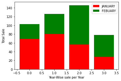
Here, what we have done is that we have stacked a bar over another bar. plt.bar(range(x_axis), FEB, bottom=JAN,color=”green”,label=”FEBRUARY”)’- This line means that, we have put the bar of FEBRUARY over the bar of JANUARY.
Horizontal Bar Graph using Matplotlib barh
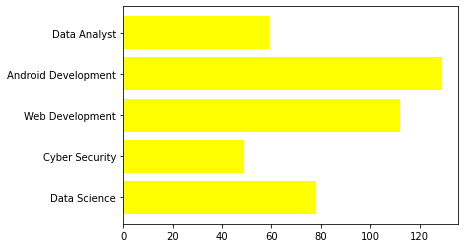
We can also make a horizontal bar graph using matplotlib.
import matplotlib.pyplot as plt
%matplotlib inline
technologies=['Data Science', 'Cyber Security', 'Web Development', 'Android Development', 'Data Analyst']
number_of_students=[78,49,112,129,59]
# for horizontal bar graph use barh
plt.barh(technologies,number_of_students,color="yellow")
Making Bar Chart using Pandas Data Frame
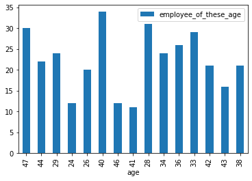
Do you know that we can also create a bar chart using the pandas’ library? Suppose if we have a data frame, we can directly create different types of plots like scatter, bar, line using a single function. In the background, pandas also use matplotlib to create graphs. Let us see how we will do so.
age=[47,44,29,24,26,40,46,41,28,34,36,33,42,43,38]
employee_of_these_age=[30,22,24,12,20,34,12,11,31,24,26,29,21,16,21]
dataset=pd.DataFrame()
# create a dataset using these data
dataset['age']=age
dataset['employee_of_these_age']=employee_of_these_age

# Use the plot function, in x axis give the age and
# in y axis give the number of people of those age
# Use bar as kind to create a bar chart
dataset.plot(x='age',y='employee_of_these_age',kind='bar')
Must Read:
- How to Convert String to Lowercase in
- How to Calculate Square Root
- User Input | Input () Function | Keyboard Input
- Best Book to Learn Python
Conclusion
Matplotlib Bar Graphs are very important as they help data scientists and data analysts to take insights from the data real quick. By going through the data without any visualization, it gets very to receive insights from it. We can use the matplotlib bar function to make bar graphs in python.
Try to run the programs on your side and let us know if you have any queries.
Happy Coding!
