
Do you want to create interactive and top-notch graphs? Well, raceplotly is there for your help. Go through this blog to learn more about this fantastic library.
About raceplotly
Raceplotly uses the Dash framework to curate web applications. It makes your graphs look much better with the aid of plotly. You need to provide your dataset and a few other parameters, and this library will display your graphs as a web app. Its dependencies include pandas and plotly.
Syntax of raceplotly
You can use this library with the help of the pip command.
pip install raceplotly
If you want to create barplots with raceplotly, use this command
from raceplotly.plots import barplot
Parameters
Parameters of barplot
The parameters of the barplot in raceplotly include your data, which is in CSV format, item_column, value_column and time_column. There are two optional arguments, also called item_color and top_entries.
The item_column is the column that contains items that have to be ranked. The value_column consists of the basis of ranking. The time_column specifies the time period in the form of months, days, years, etc. The attributes item_color, and top_entries are not necessary to use. item_color can be used to state the color properties of the columns, while top_entries shows the top 10 entries by default. You can suggest a value as per your requirement too.
Parameters of plot function of barplot
Once you have specified these, you can use the plot() function with the parameters as title, item_label, value_label, and frame_duration. 500 milliseconds is the default time duration of the frame. Once you have named the plot, you can tell the orientation – whether it is vertical or horizontal, too. Then, you can also include the initial_frame parameter. Here, you can suggest the minimum or maximum values.
Now, you should also name the item, value, and label columns. For this, the raceplotly library has item_label, value_label, and time_label parameters. You can choose a date type that works with strftime for the date_format parameter.
Bar Chart Races
The raceplotly library excels at providing the best support to a user in curating bar chart traces. These types of graphs are quite trending as they tend to provide an enhanced graphical representation of data. Raceplotly makes it easy for you to form a bar chart race because you don’t need to code much. This was the case earlier with plotly and Dash.
![[Fixed] typeerror can’t compare datetime.datetime to datetime.date](https://www.pythonpool.com/wp-content/uploads/2024/01/typeerror-cant-compare-datetime.datetime-to-datetime.date_-300x157.webp)
Pandas with raceplotly
This library works with Pandas datasets also. In fact, you should use the pandas data frame type to create raceplotly preferred datasets.
In the given example, you can check the rankings of three students with the help of the bar chart.
from raceplotly.plots import barplot
import pandas as pd

# Create a Pandas DataFrame
df = pd.DataFrame({
    "item_column": ["A", "B", "C"],
    "value_column": [10, 20, 30],
    "time_column": ["2023-01-01", "2023-02-01", "2023-03-01"]
})

# Create a bar race chart
chart = barplot(df, item_column="item_column", value_column="value_column", time_column="time_column")

# Display the chart
chart.plot(title="Bar Race Chart Example")
Now, let us assess the kind of output we will obtain.


Bar Plot with raceplotly and dash
Raceplotly when combined with dash, results in a chart that can be embedded in a web application. So the given example uses Dash and some html components to make this web app.
from dash import Dash, html, dcc

import pandas as pd
from raceplotly.plots import barplot

data = pd.DataFrame({
    "item_column": ["A", "B", "C"],
    "value_column": [70, 45, 63],
    "time_column": ["2023-01-01", "2023-02-01", "2023-03-01"]
})
my_raceplot = barplot(data,  item_column='item_column', value_column='value_column', time_column='time_column')


my_raceplot.plot(item_label = 'Students', value_label = 'Weight', frame_duration = 900)

app= Dash(__name__)

app.layout = html.Div(dcc.Graph(figure=my_raceplot.fig))

app.run(debug=True)
The output will be like this:


Raceplotly and streamlit
If you need an alternative to Dash, you can go with Streamlit. Streamlit is a kind of library that users can use to create web applications in Python. You can visualize your data at the same time.
So, the foremost thing is to import the libraries: streamlit and raceplotly. After importing, you can use raceplotly to create the race bar chart, and the streamlit application will include this chart with the help of the write() function. This way the chart that you have created will display as a web app. You can go through the following code to understand this implementation:
import streamlit as st

# Create a Pandas DataFrame
df = pd.DataFrame({
    "item_column": ["Alice", "Bob", "Carol"],
    "value_column": [10, 20, 30],
    "time_column": ["2023-01-01", "2023-02-01", "2023-03-01"]
})

# Create a bar race chart
chart = barplot(df, item_column="item_column", value_column="value_column", time_column="time_column")

# Add the chart to the Streamlit app
st.write(chart)
In order to check the output, you can obtain the streamlit URL in this form: Network URL: http://172.28.0.12:8501 and External URL: http://34.73.37.204:8501
Dashboard with raceplotly
You can also use raceplotly to create an interactive dashboard. These can be used for many use cases like:
- Web applications and pages with an interactive display
- Changes in market
- Changes in employee engagement for the departments
- Changes in student performance in different areas
- Customer satisfaction mapping
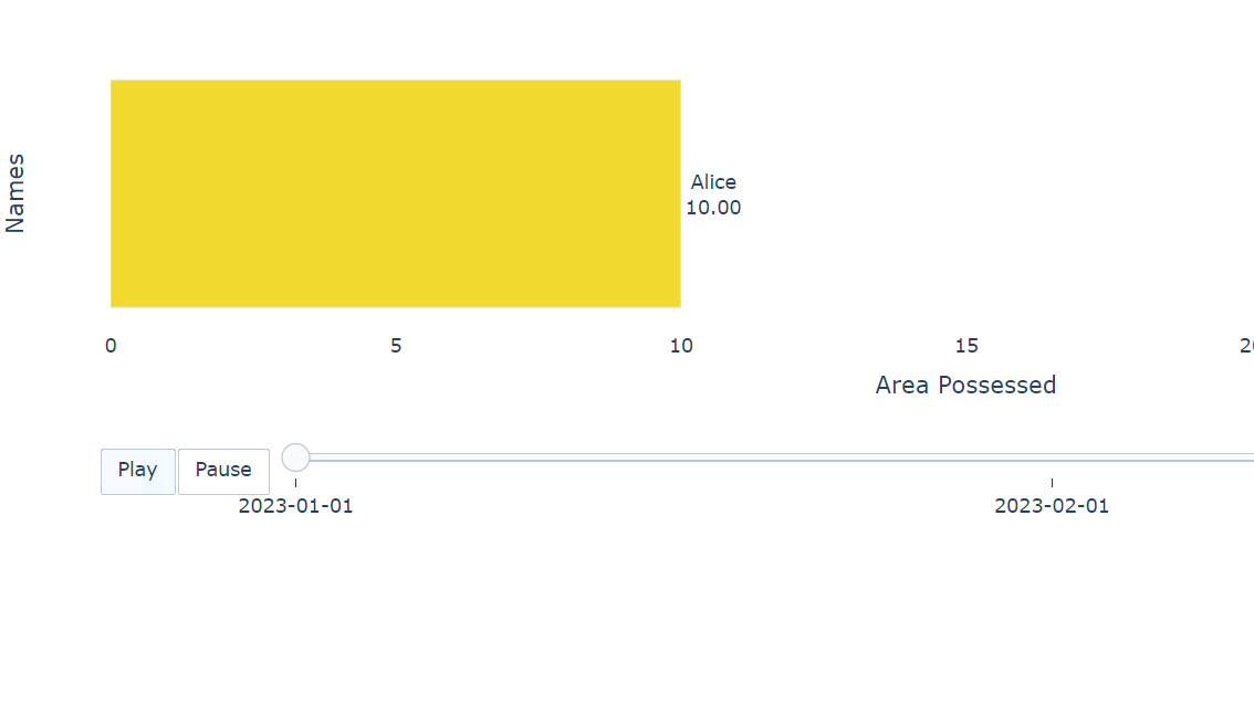
So, if you want to create a dashboard with the help of the raceplotly library, you can use Dash and its related libraries to import common as well as complex HTML components like tables. Here, I have used a panda’s dataframe dataset, but you are free to use any other form of data too. However, pandas are preferred. A Dash function will create a web application for your data.
pip install raceplotly

from dash import Dash, html, dcc

import pandas as pd
from raceplotly.plots import barplot

data = pd.DataFrame({
    "item_column": ["Alice", "Bob", "Carol"],
    "value_column": [10, 20, 30],
    "time_column": ["2023-01-01", "2023-02-01", "2023-03-01"]
})
my_raceplot = barplot(data,  item_column='item_column', value_column='value_column', time_column='time_column')

my_raceplot.plot(item_label = 'Names', value_label = 'Area Possessed', frame_duration = 800)

app= Dash(__name__)

app.layout = html.Div(dcc.Graph(figure=my_raceplot.fig))

app.run(debug=True)
Now, let us assess how the plot varies at different instances of time.


![[Solved] runtimeerror: cuda error: invalid device ordinal](https://www.pythonpool.com/wp-content/uploads/2024/01/Solved-runtimeerror-cuda-error-invalid-device-ordinal-300x157.webp)
What is plotly express and is it different from raceplotly?
Even though these two libraries perform the same function, they have different functionalities. Let us have a look at the differences between these two libraries.
| Feature | Plotly Express | Raceplotly |
|---|---|---|
| Purpose | It is used for General-purpose data visualization | It is used for Specialized for animated bar race charts |
| Flexibility | It supports a wider range of chart types | It is limited to animated bar race charts |
| Ease of use | It supports high-level, pre-configured functions | It is more focused on data preparation and customization |
| Applications | Its Applications include Exploratory data analysis along with quick visualization prototyping. | Its Applications include Time-series rankings and visualizing changes in rankings over time. |
FAQS
You can use Dash to embed the charts in the form of a web application or export them in JSON format.
Conclusion
This blog gives you an overview of the raceplotly library in Python. It covers its dependencies along with its mandatory and optional parameters. With the help of this library, you can easily create code-less dashboards and race charts. It’s a really useful library.
![[Fixed] nameerror: name Unicode is not defined](https://www.pythonpool.com/wp-content/uploads/2024/01/Fixed-nameerror-name-Unicode-is-not-defined-300x157.webp)
![[Fixed] typeerror: type numpy.ndarray doesn’t define __round__ method](https://www.pythonpool.com/wp-content/uploads/2024/01/Fixed-typeerror-type-numpy.ndarray-doesnt-define-__round__-method-300x157.webp)