Hello geeks, and welcome! In this article, we will cover the Matplotlib aspect ratio. Along with that, we look at its syntax and what difference it makes to the graph. To do so, we will look at a couple of examples. But first, let us try to generate a general overview of the function.
Aspect ratio generally means the height-to-width ratio of an image or screen. For instance, a 1:1 ratio gives us a square. As we are aware of the fact that Matplotlib is the plotting library of Python. So, for this particular case, the aspect ratio becomes the ratio of the Y-axis to the X-axis. In total, there are 4 coordinate systems in Matplotlib, which are data, axes, figures, and display.
In the next section, let us look at the syntax of the function, which will help change the aspect ratio.
Syntax
Axes.set_aspect()This is the general syntax of our function. A couple of parameters are associated with it, which we will cover in the next section.
Parameter
1. ASPECT
This parameter can be auto or equal. In the case of auto, it automatically fills the rectangle with data. If equal is used, the same scaling occurs from data to plot. When we use aspect=1, it will give results similar to aspect=”equal.”
2. ADJUSTABLE
By default, it is None. But in case it is not equal to none, it is responsible for deciding the parameter to be adjusted to meet the new aspect.
3. ANCHOR
This decides where the axes will be drawn if there is any extra space due to aspect limitations.
Example
As we are done with all the theory portions related to the Matplotlib aspect ratio, This section will look at how this function works and how it affects the output. In order to do so, we first need to code a simple plot.
import matplotlib.pyplot as plt
plt.plot([1,5],[2,3])
plt.xlabel("X-axis")
plt.ylabel("Y-axis")
plt.show()
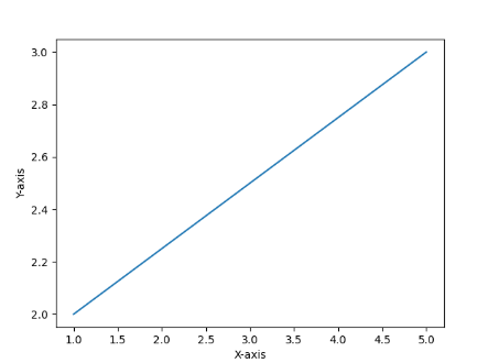
We have created a simple matplotlib plot. Now, the next goal is to change the above graph’s aspect ratio. Let us see how we can do it.
import matplotlib.pyplot as plt
plt.plot([1,5],[2,3])
plt.xlabel("X-axis")
plt.ylabel("Y-axis")
axes=plt.gca()
axes.set_aspect(10)
plt.show()
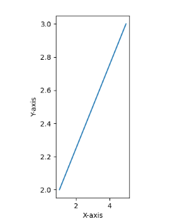
Here, you can see that we have successfully executed the change in aspect ratio. Not let us go line by line and understand how it was done. The first thing is to plot the graph, after which we have used the “gca” method. This method is particularly used to select the current polar axes. After which, we used our aspect parameter. In the end, we can see the difference between the 2 graphs.
We can also use any of the parameters as discussed above. Let us see what difference it makes –
import matplotlib.pyplot as plt
plt.plot([1,5],[2,3])
plt.xlabel("X-axis")
plt.ylabel("Y-axis")
axes=plt.gca()
axes.set_aspect(7,adjustable='datalim')
plt.show()
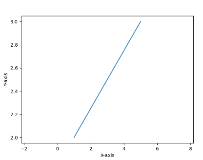
Here, we used the adjustable parameter. We can stop the difference that it creates compared to the original plot. One key thing to pay attention to is that even after all the changes we have made, the plot’s main content remains unchanged.
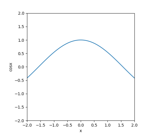
Square aspect ratio
In matplotlib, we can also set the square aspect ratio. Here all the axis has equal starting and ending points. The code below shows how this can be executed.
import numpy as np
import matplotlib.pyplot as plt

x = np.linspace(-2,2,100)
y = np.cos(x)

fig = plt.figure()
ax = fig.add_subplot(111)

plt.plot(x,y)
plt.xlim(-2,2)
plt.ylim(-2,2)

ax.set_aspect('equal')

plt.xlabel("x")
plt.ylabel("cosx")

plt.show()
3D plot aspect ratio
import numpy as np
import matplotlib.pyplot as plt

x = np.outer(np.linspace(-2, 2, 32), np.ones(32))
y = x.copy().T
z = (np.sin(x ** 2) + np.tan(y ** 2))

fig = plt.figure(figsize=(14, 9))
ax = plt.axes(projection='3d')

ax.plot_surface(x, y, z)

plt.show()
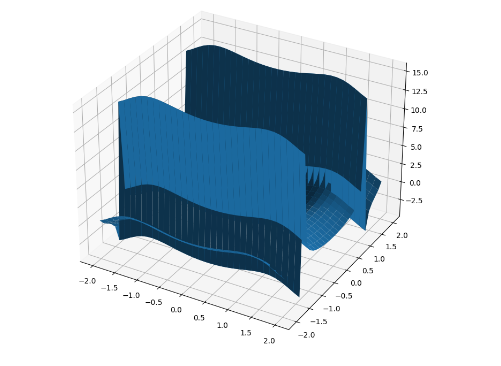
Above, we have successfully coded a 3d plot. The plot is a mixture of sin and tan functions. To get a 3d projection, we have specified it to 3d. Now let us see how we can differ in the aspect ratio of this plot.
import numpy as np
import matplotlib.pyplot as plt

x = np.outer(np.linspace(-2, 2, 32), np.ones(32))
y = x.copy().T
z = (np.sin(x ** 2) + np.tan(y ** 2))

fig = plt.figure(figsize=(14, 9))
ax = plt.axes(projection='3d')
ax.set_box_aspect((np.ptp(x), np.ptp(y), np.ptp(z)))

ax.plot_surface(x, y, z)

plt.show()
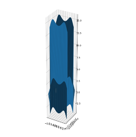
Here above, we can see that we have successfully changed the plot’s aspect ratio. To change the aspect ratio, we have used the NumPy function “ptp.” This means peak-to-peak value ranges from minimum to maximum.
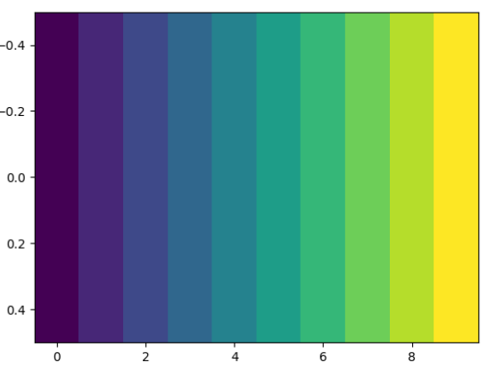
Image aspect ratio
import numpy as np
import matplotlib.pyplot as plt

arr = np.reshape(np.arange(1,11),(1,10))

plt.imshow(arr)
plt.show()
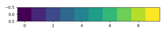
Above, we have successfully created an image with the NumPy function’s help. Then, display it using the imshow function. To change the aspect ratio, we need to add one comment in the program, as shown below.
import numpy as np
import matplotlib.pyplot as plt

arr = np.reshape(np.arange(1,11),(1,10))

plt.imshow(arr,aspect="auto")
plt.show()
Constrain aspect ratio
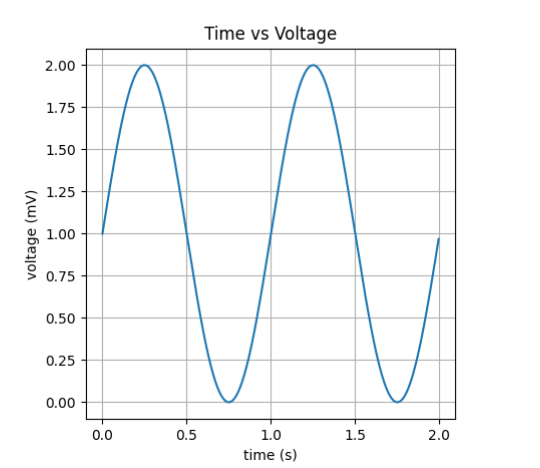
In constraining the aspect ratio, there are six major types of parameters. (Scaled, Equal, tight, auto, image, square). These parameters can be adjusted by using the plt.axis() method. We will be seeing each one of them in detail one by one. We will use the same time vs. voltage graph from all the conditions.
1. Scaled
This parameter Scales both axes equally. This means you can draw a perfect circle in your plot box. All the outlier data points will be scaled accordingly to show them.
import matplotlib.pyplot as plt
import numpy as np
t = np.arange(0.0, 2.0, 0.005)
s = 1 + np.sin(2 * np.pi * t)
fig, axes = plt.subplots()
axes.plot(t, s)
axes.set(xlabel='time (s)', ylabel='voltage (mV)', title='Time vs Voltage')
axes.grid()
axes.axis('scaled')
fig.savefig("sample.png")
plt.show()
2. Equal
This parameter changes axis limits to equalize both the scaling. Instead of the scale, we need to use it equally in our code to get this all.
axes.axis('equal')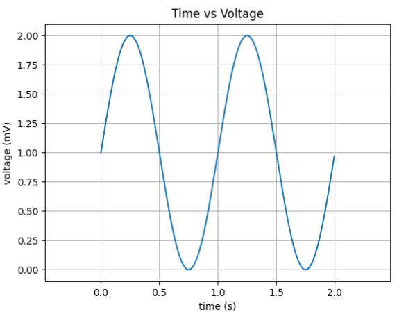
3. Tight
This parameter Disables auto-scaling and sets the limit so that you can view all the points in your graphs. It also includes outliers. To get this, we need to make a small change, as shown below.
axes.axis('tight')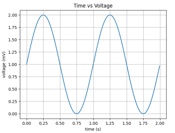
4. AUTO
This parameter auto-scales both the axes. To get this, we need to make a small change, as shown below.
axes.axis('auto')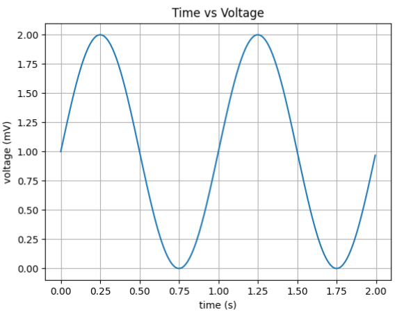
5. IMAGE
This parameter Scales so that your data limits are equal to axis limits. To get this, we need to make a small change, as shown below.
axes.axis('image')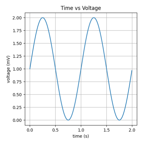
6. SQUARE
This parameter forces the plot to become square. This means that both the x and y axes have the same length. To get this, we need to make the following change
axes.axis('square')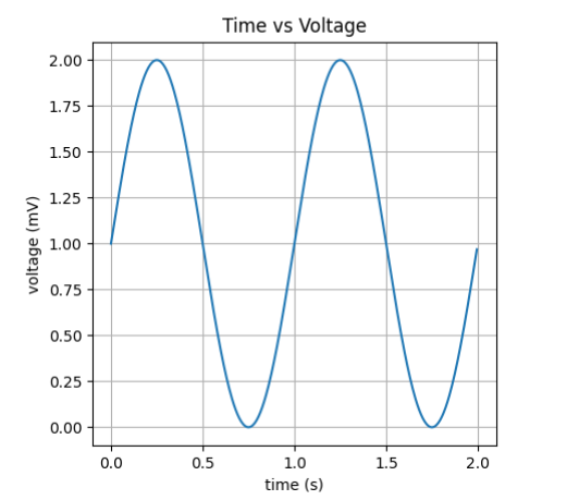
Also Read
- How to Calculate Square Root in Python
- Numpy Square Root
- How to Display Images Using Matplotlib Imshow Function
- NumPy Identity Matrix
- What is cv2 imshow?
Conclusion
In this article, we covered the Matplotlib aspect ratio. We looked at the syntax as well as the different parameters associated with it. We also tried to enhance our understanding by looking at a couple of examples. In the end, we can conclude that to change the aspect ratio of a plot. We can use the function to “.set _axes().”
I hope this article was able to clear all doubts. But if you have any unsolved queries, feel free to write them down below in the comment section.
If you’re done reading this, why not read about the tempfile next?
![[Fixed] typeerror can’t compare datetime.datetime to datetime.date](https://www.pythonpool.com/wp-content/uploads/2024/01/typeerror-cant-compare-datetime.datetime-to-datetime.date_-300x157.webp)
![[Fixed] nameerror: name Unicode is not defined](https://www.pythonpool.com/wp-content/uploads/2024/01/Fixed-nameerror-name-Unicode-is-not-defined-300x157.webp)
![[Solved] runtimeerror: cuda error: invalid device ordinal](https://www.pythonpool.com/wp-content/uploads/2024/01/Solved-runtimeerror-cuda-error-invalid-device-ordinal-300x157.webp)
![[Fixed] typeerror: type numpy.ndarray doesn’t define __round__ method](https://www.pythonpool.com/wp-content/uploads/2024/01/Fixed-typeerror-type-numpy.ndarray-doesnt-define-__round__-method-300x157.webp)