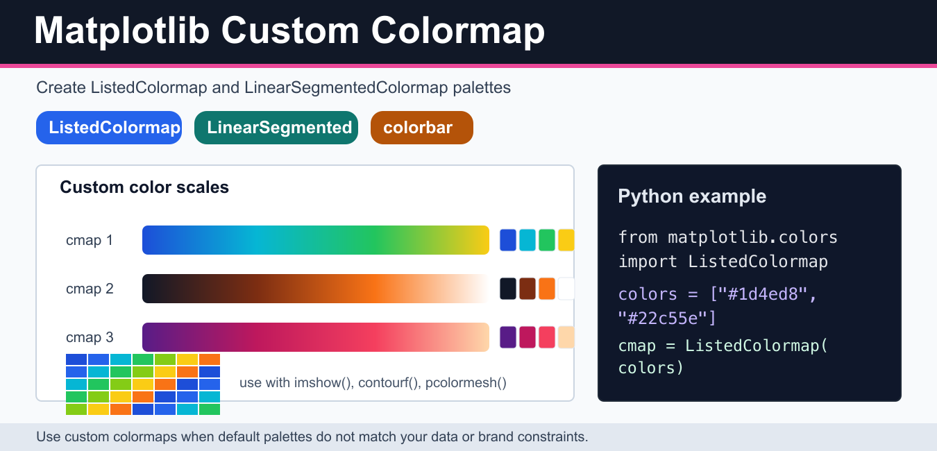
Quick answer: Use ListedColormap for discrete category colors and LinearSegmentedColormap.from_list for an interpolated gradient. Normalize the data range explicitly and add a labeled colorbar so the mapping is interpretable.
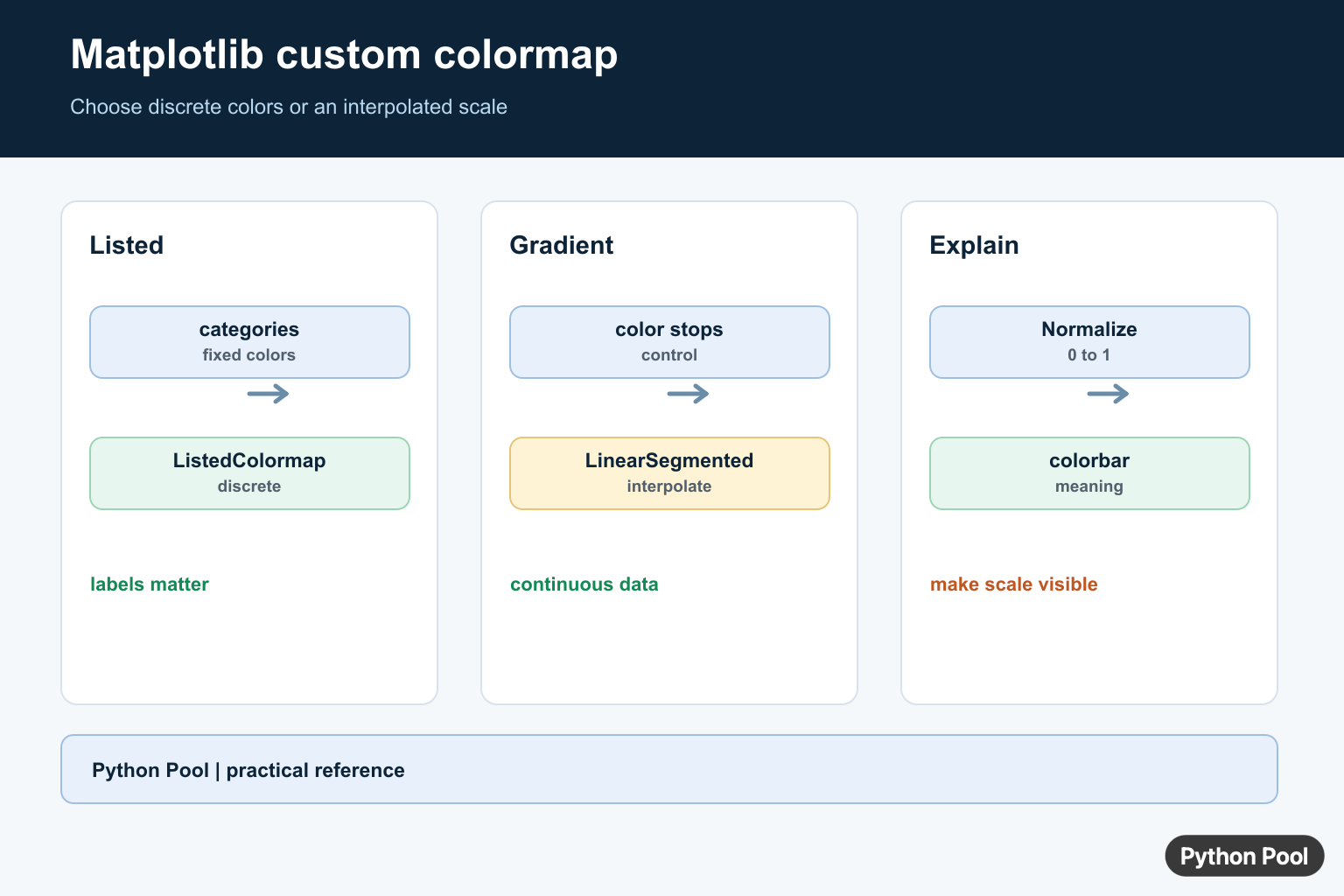
A Matplotlib custom colormap lets you control how numeric values map to colors. Use one when the built-in colormaps do not match your data, accessibility needs, brand colors, or visual story. The two most common tools are ListedColormap for a fixed list of colors and LinearSegmentedColormap for a smooth gradient between colors.
If you only need to choose a built-in palette, start with the PythonPool guide to Matplotlib cmap. This article focuses on building your own palette and using it with functions such as imshow(), contourf(), and pcolormesh().
Create a discrete colormap with ListedColormap
Use ListedColormap when each color is a separate category or class. This is useful for segmentation masks, status maps, heatmap buckets, and categorical arrays. The color order matters because Matplotlib maps values through the list.
import numpy as np
import matplotlib.pyplot as plt
from matplotlib.colors import ListedColormap

colors = ["#1d4ed8", "#22c55e", "#facc15", "#f97316"]
cmap = ListedColormap(colors, name="blue_green_yellow_orange")

data = np.array(
    [
        [0, 1, 2, 3],
        [1, 2, 3, 0],
        [2, 3, 0, 1],
    ]
)

fig, ax = plt.subplots()
image = ax.imshow(data, cmap=cmap)
fig.colorbar(image, ax=ax, ticks=[0, 1, 2, 3])
plt.show()
For image-style data, the Matplotlib imshow guide explains how arrays become images. If your grid cells represent coordinates rather than pixels, compare this with Matplotlib pcolormesh.
Create a smooth gradient with LinearSegmentedColormap
Use LinearSegmentedColormap.from_list() when you want a continuous gradient. The simplest form passes a list of colors. Matplotlib interpolates between them to create the full scale.
import numpy as np
import matplotlib.pyplot as plt
from matplotlib.colors import LinearSegmentedColormap

cmap = LinearSegmentedColormap.from_list(
    "navy_teal_lime",
    ["#0f172a", "#0f766e", "#bef264"],
)

data = np.random.default_rng(42).normal(size=(20, 20))

fig, ax = plt.subplots()
image = ax.imshow(data, cmap=cmap)
fig.colorbar(image, ax=ax)
plt.show()
A smooth gradient is usually better for continuous values, while a listed colormap is clearer for categories. For filled contour charts, use the custom colormap with Matplotlib contourf.
Use color stops for more control
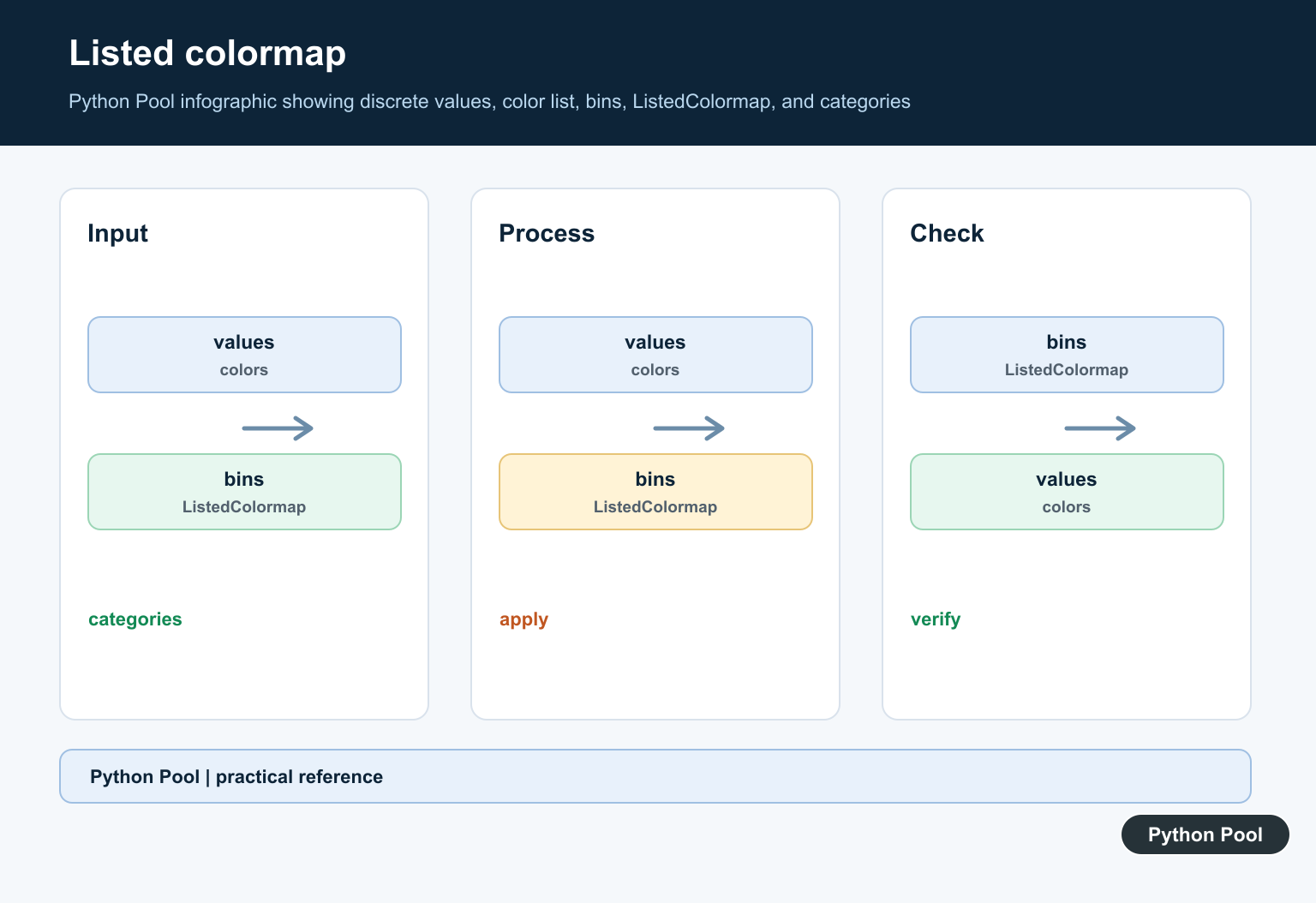
You can control where colors appear by passing pairs of (position, color). Positions run from 0 to 1. This is helpful when a middle color should occupy a larger or smaller part of the range.
from matplotlib.colors import LinearSegmentedColormap

cmap = LinearSegmentedColormap.from_list(
    "risk_scale",
    [
        (0.0, "#1d4ed8"),
        (0.45, "#22c55e"),
        (0.70, "#facc15"),
        (1.0, "#dc2626"),
    ],
)
When the color scale carries meaning, always include a colorbar. PythonPool’s Matplotlib colorbar guide covers labels, ticks, sizing, and placement.
Reverse or trim a colormap
Every Matplotlib colormap can be reversed with reversed(). You can also sample only part of an existing colormap to reduce the dynamic range. This is useful when the darkest or lightest colors are too extreme for your plot.
import numpy as np
import matplotlib.pyplot as plt
from matplotlib.colors import LinearSegmentedColormap

base = plt.colormaps["viridis"]
trimmed_colors = base(np.linspace(0.15, 0.85, 256))
trimmed = LinearSegmentedColormap.from_list("trimmed_viridis", trimmed_colors)
reversed_map = trimmed.reversed()

print(trimmed.name)
print(reversed_map.name)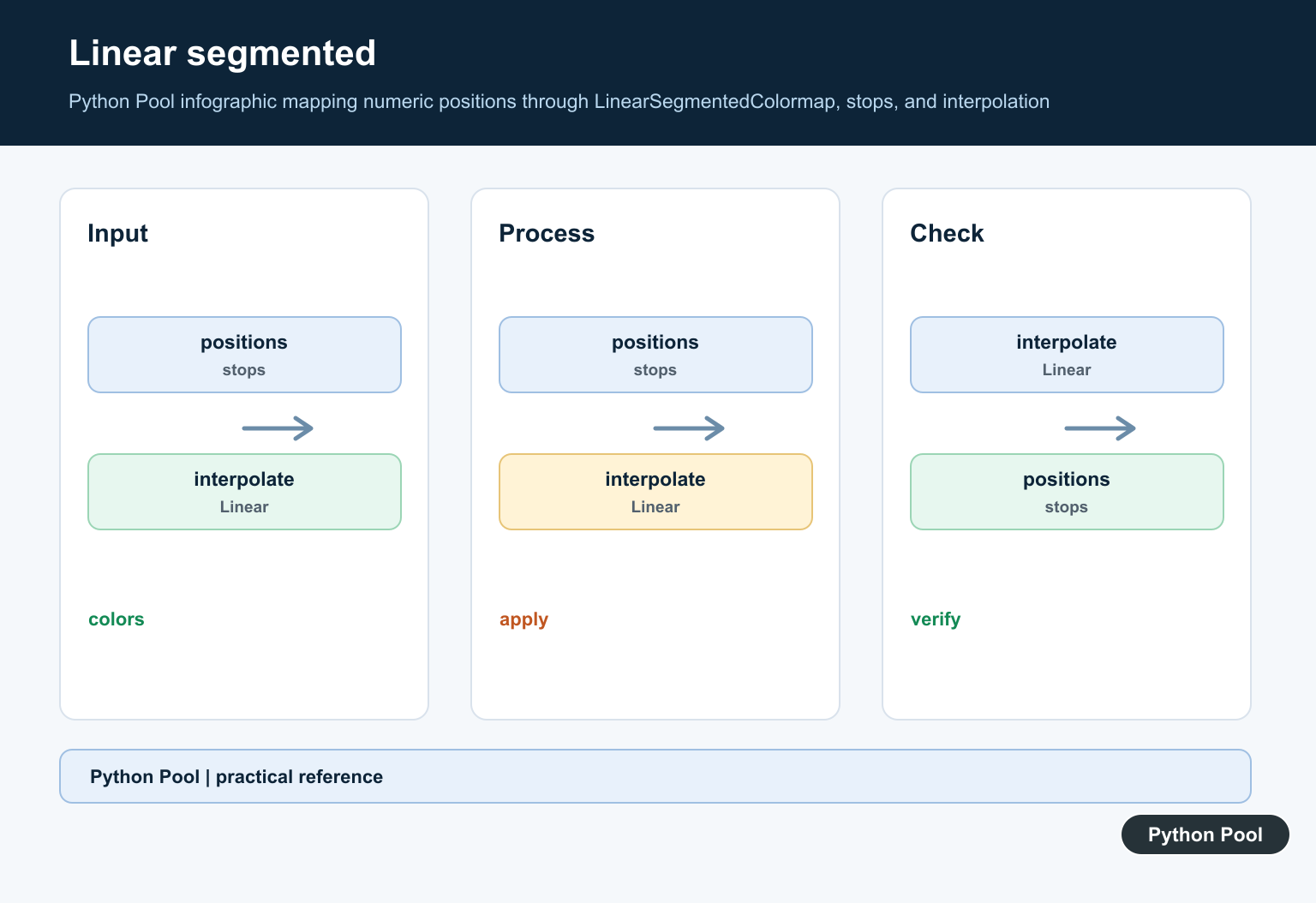
Register a custom colormap
If you reuse a custom colormap across several plots, register it with Matplotlib’s colormap registry. After registration, you can access it by name through plt.colormaps. Use a distinctive name to avoid confusion with built-in colormaps.
import matplotlib as mpl
from matplotlib.colors import ListedColormap

brand_cmap = ListedColormap(["#111827", "#2563eb", "#22c55e"], name="brand_steps")
mpl.colormaps.register(brand_cmap)

same_cmap = mpl.colormaps["brand_steps"]
print(same_cmap.name)
Colormap design tips
- Match the data type: use sequential maps for ordered values, diverging maps around a midpoint, and categorical maps for labels.
- Avoid unnecessary rainbow palettes: they can create false visual boundaries.
- Check contrast: colors should remain readable with labels, grid lines, and annotations.
- Add a colorbar: readers need to know what the colors mean.
- Export and inspect: colors can change when compressed, printed, or embedded in documents.
If the plot also uses grid lines, keep them subtle so they do not compete with the color scale. The Matplotlib grid guide covers grid alpha and line style. When exporting final figures, use the Matplotlib savefig guide.
When to build a custom colormap
Create a custom colormap only when it solves a real communication problem. A built-in perceptual colormap is usually safer for scientific data because it has already been designed for smooth visual change. A custom map makes sense when categories have known brand colors, when a dashboard needs a specific warning scale, or when the default palette hides important thresholds.
Test the colormap on real data, not only on a smooth gradient. Check the minimum, maximum, midpoint, missing values, and any thresholds the reader must notice. If two important values look almost identical, revise the palette before publishing. Also inspect the exported PNG or PDF, because colors that look distinct on your monitor can blend together after compression or printing.
For categorical data, keep the number of colors small and visually balanced. For continuous data, avoid abrupt color jumps unless those jumps mark meaningful boundaries. When the audience needs exact values, pair the colormap with a labeled colorbar and clear title instead of expecting color alone to carry the explanation.
Official Matplotlib references
- Creating colormaps in Matplotlib
- Choosing colormaps in Matplotlib
- ListedColormap
- LinearSegmentedColormap
- ColormapRegistry.register
- pyplot.imshow
- pyplot.colorbar
Use ListedColormap For Categories
A listed map assigns colors from a fixed sequence. It is appropriate for classes or bins where each color has a discrete meaning. Choose colors with enough contrast and make the category order explicit instead of relying on an accidental data order.
import matplotlib.pyplot as plt
from matplotlib.colors import ListedColormap

colors = ["#1f77b4", "#ff7f0e", "#2ca02c"]
cmap = ListedColormap(colors, name="pythonpool_categories")

fig, ax = plt.subplots()
image = ax.imshow([[0, 1, 2], [2, 1, 0]], cmap=cmap, vmin=0, vmax=2)
fig.colorbar(image, ax=ax, ticks=[0, 1, 2])
fig.tight_layout()
Use A Segmented Gradient For Continuous Values
A segmented map interpolates colors between control points. Pass a list of color names or RGB values to from_list, and choose the number of samples deliberately when you need a smooth continuous scale.
from matplotlib.colors import LinearSegmentedColormap

heatmap = LinearSegmentedColormap.from_list(
    "pythonpool_heat", ["#0d3b66", "#f4d35e", "#ee964b"], N=256
)

ax.imshow([[0.0, 0.5, 1.0]], cmap=heatmap, vmin=0, vmax=1)
Normalize And Explain The Scale
A colormap consumes values in the normalized 0-to-1 interval. Normalize maps your data’s vmin and vmax into that interval, while a colorbar shows readers how color corresponds to the underlying values. Avoid using a rainbow scale when ordered perceptual lightness matters.
from matplotlib.colors import Normalize

normalizer = Normalize(vmin=-10, vmax=10)
rgba = heatmap(normalizer(2.5))
print(rgba)
Matplotlib’s colormap guide distinguishes listed maps, segmented maps, normalization, and colorbar communication.
For related visualization controls, compare colorbars, built-in cmap choices, and plot grids when making a figure easier to interpret.
Frequently Asked Questions
How do I create a custom colormap in Matplotlib?
Use ListedColormap for a fixed sequence of colors or LinearSegmentedColormap.from_list for an interpolated gradient.
What is the difference between ListedColormap and LinearSegmentedColormap?
ListedColormap maps values to a discrete list, while LinearSegmentedColormap interpolates between color stops.
Why use Normalize with a custom colormap?
Normalize maps the data range into the 0-to-1 interval that a Matplotlib colormap expects, making the visual mapping explicit.
How do I show the meaning of a colormap?
Add a colorbar and label its numeric or categorical meaning so readers do not have to infer the scale from color alone.