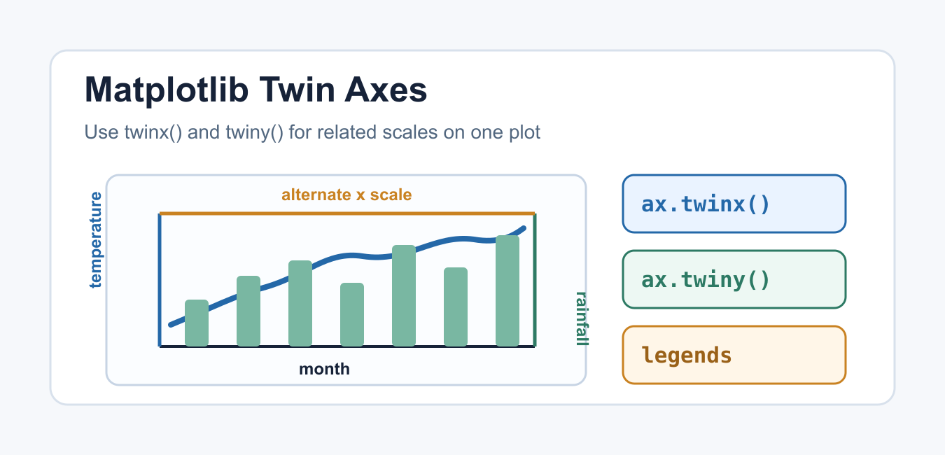
Quick answer: Matplotlib’s twinx() creates a second Axes sharing the x-axis but with an independent y-axis; twiny() shares y and creates another x-axis. Twin axes can be useful for different units, but they also make comparisons easy to misread. Label both scales, combine legends, and align layout before exporting.
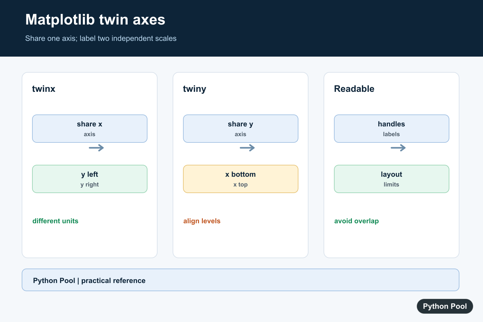
Matplotlib twin axes let one plot show two related scales without forcing the data into the same unit. The common methods are Axes.twinx(), which adds a second y-axis on the right, and Axes.twiny(), which adds a second x-axis at the top.
Use this pattern when two measurements share one natural axis but need different labels or units. For example, a monthly chart may show temperature on the left y-axis and rainfall on the right y-axis. The important rule is to make the relationship obvious with labels, colors, legends, and a clear title.
Twin axes work best when the two series describe the same event, time range, or observation group. They are weaker when the chart combines unrelated metrics only to save space. If the reader needs to compare shapes rather than understand context, separate subplots are usually easier to trust.
What Does twinx() Do?
twinx() creates a new axes object that shares the original x-axis. The new axes gets its own y-axis, so you can plot a second series with a different scale. This is useful for time series, sensor readings, finance charts, and reports where the x-axis is the same for both datasets.
import matplotlib.pyplot as plt

months = ["Jan", "Feb", "Mar", "Apr", "May"]
temperature = [20, 23, 27, 31, 34]
rainfall = [42, 36, 28, 18, 12]

fig, ax1 = plt.subplots()
ax2 = ax1.twinx()

ax1.plot(months, temperature, color="tab:red", marker="o")
ax2.bar(months, rainfall, color="tab:blue", alpha=0.35)

ax1.set_ylabel("Temperature (C)")
ax2.set_ylabel("Rainfall (mm)")
plt.show()
The original axes and the twin axes are separate objects. That means each one has its own labels, ticks, scale, artists, and legend handles. Treat them as two coordinated axes rather than one overloaded chart. Name the variables clearly, such as ax1 and ax2, so later formatting calls do not accidentally style the wrong side.
Style the Two Y-Axes Clearly
A dual-axis plot can become misleading when the styling is vague. Color each y-axis label to match its data series and keep the title specific. If the audience cannot immediately tell which line belongs to which scale, use two subplots instead of twin axes.
import matplotlib.pyplot as plt

x = [1, 2, 3, 4, 5]
sales = [120, 150, 170, 165, 190]
margin = [18, 21, 25, 23, 27]

fig, ax1 = plt.subplots(figsize=(8, 4))
ax2 = ax1.twinx()

ax1.plot(x, sales, color="tab:blue", label="Sales")
ax2.plot(x, margin, color="tab:green", label="Margin")

ax1.set_xlabel("Quarter")
ax1.set_ylabel("Sales ($k)", color="tab:blue")
ax2.set_ylabel("Margin (%)", color="tab:green")
ax1.tick_params(axis="y", labelcolor="tab:blue")
ax2.tick_params(axis="y", labelcolor="tab:green")
ax1.set_title("Sales and Margin by Quarter")
plt.show()
Dual-axis labels often need extra right padding, especially when saved as PNG for reports or blog images.

Combine Legends From Both Axes
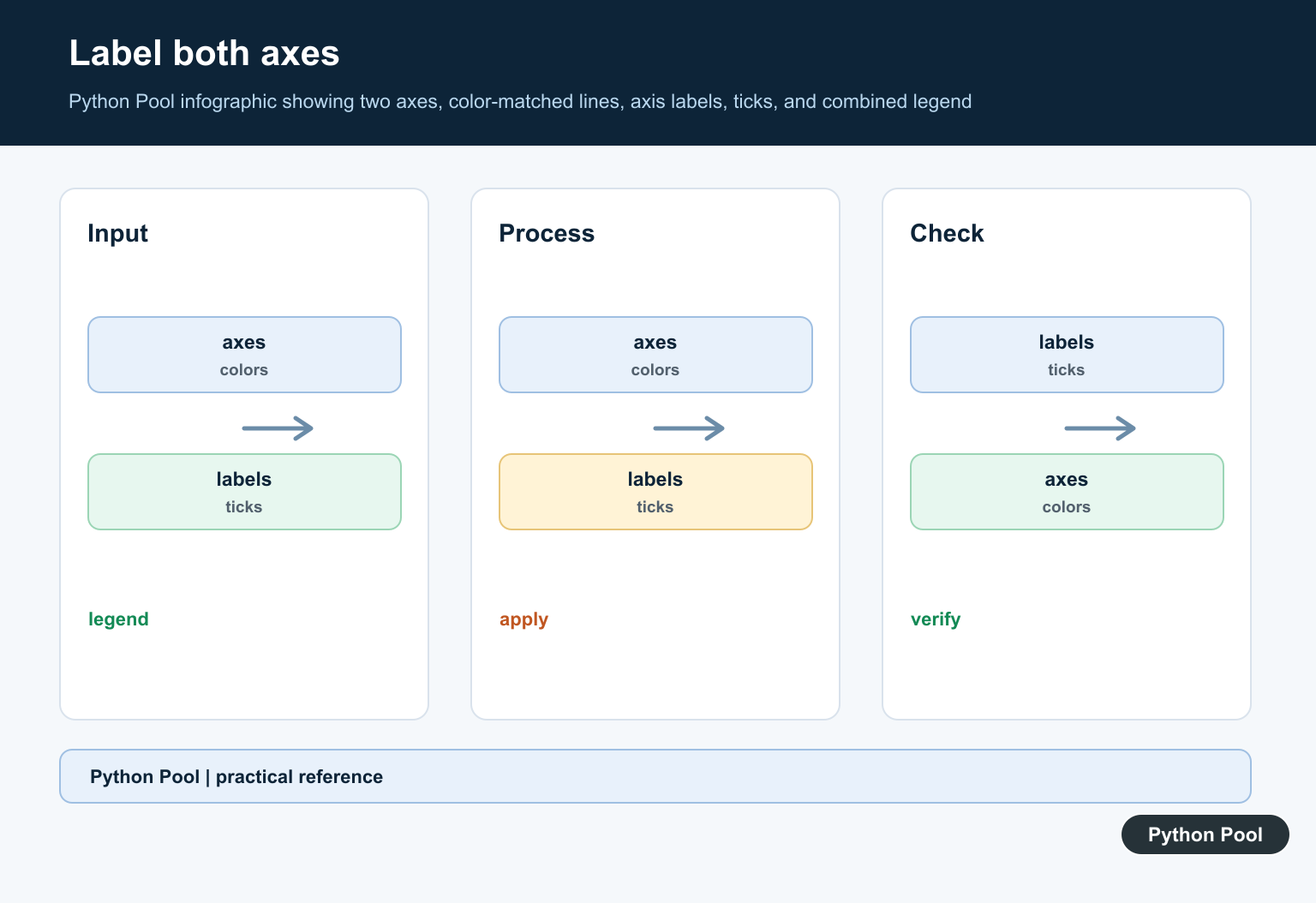
Calling legend() on only one axes will not automatically include artists from the twin axes. Collect the handles and labels from both axes, then pass the combined lists to a single legend.
import matplotlib.pyplot as plt

x = [0, 1, 2, 3, 4]
users = [100, 160, 230, 310, 390]
latency = [220, 210, 190, 175, 168]

fig, ax1 = plt.subplots()
ax2 = ax1.twinx()

line1 = ax1.plot(x, users, color="tab:purple", label="Users")
line2 = ax2.plot(x, latency, color="tab:orange", label="Latency")

lines = line1 + line2
labels = [line.get_label() for line in lines]
ax1.legend(lines, labels, loc="upper left")

ax1.set_ylabel("Users")
ax2.set_ylabel("Latency (ms)")
plt.show()
This keeps the legend in one predictable location and avoids duplicate boxes. If the plot also uses uncertainty bands or markers, see the guide to Matplotlib errorbar for clearer labeling patterns.
Use twiny() for a Second X-Axis
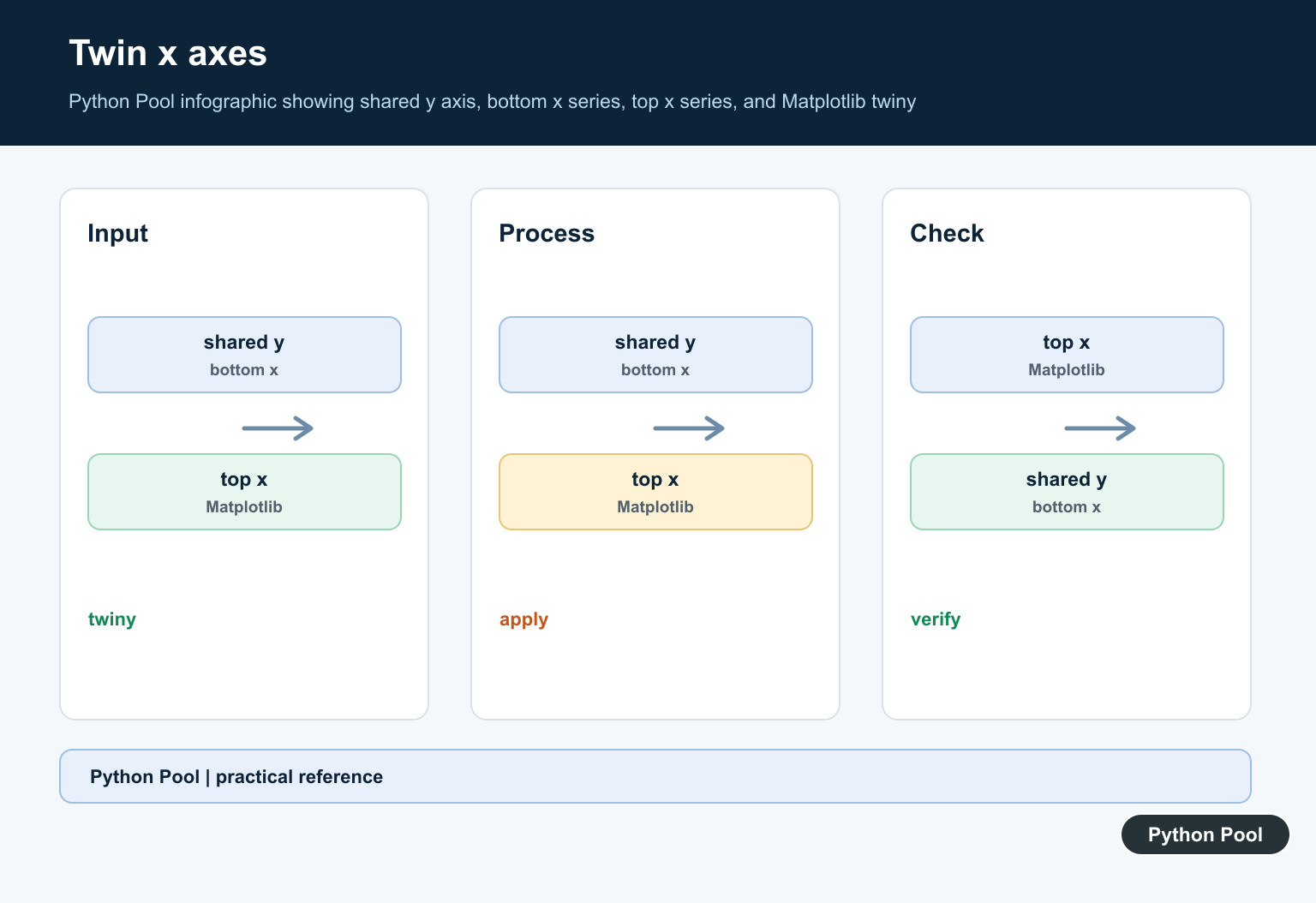
twiny() creates a new axes object that shares the original y-axis but adds another x-axis at the top. It is less common than twinx(), but it helps when the same vertical values can be read against two horizontal units.
import matplotlib.pyplot as plt

celsius = [0, 10, 20, 30, 40]
pressure = [101.3, 102.0, 103.2, 104.1, 105.0]
fahrenheit = [value * 9 / 5 + 32 for value in celsius]

fig, ax_bottom = plt.subplots()
ax_top = ax_bottom.twiny()

ax_bottom.plot(celsius, pressure, color="tab:blue")
ax_bottom.set_xlabel("Temperature (C)")
ax_bottom.set_ylabel("Pressure (kPa)")

ax_top.set_xlim(fahrenheit[0], fahrenheit[-1])
ax_top.set_xlabel("Temperature (F)")
plt.show()
When the top axis is a mathematical conversion of the bottom axis, Matplotlib’s secondary axis API may be a better fit. Use twiny() when you need an independent axes object; use a secondary axis when you are showing a direct unit conversion.
Use Secondary Axis for Unit Conversions
For direct conversions, secondary_yaxis() or secondary_xaxis() can be easier to maintain than a full twin axes object. The conversion functions make the relationship explicit and reduce the chance that the two scales drift apart.
import matplotlib.pyplot as plt

celsius = [0, 10, 20, 30, 40]
energy = [4, 7, 11, 18, 29]

def c_to_f(value):
    return value * 9 / 5 + 32

def f_to_c(value):
    return (value - 32) * 5 / 9

fig, ax = plt.subplots()
ax.plot(celsius, energy)
ax.set_xlabel("Temperature (C)")
ax.set_ylabel("Energy use")

secax = ax.secondary_xaxis("top", functions=(c_to_f, f_to_c))
secax.set_xlabel("Temperature (F)")
plt.show()
The official Matplotlib gallery also has a two scales example that shows the same core idea with different units on one figure.
Common Mistakes With Twin Axes
Do not use twin axes just to make unrelated data fit into one chart. If the viewer has to compare two independent stories, separate subplots are usually clearer. Avoid hiding one axis, avoid matching colors poorly, and do not imply that crossing lines have a special meaning unless the units are actually comparable.
import matplotlib.pyplot as plt

fig, ax1 = plt.subplots()
ax2 = ax1.twinx()

ax1.grid(True, axis="y", alpha=0.3)
ax2.grid(False)

ax1.set_title("Keep one grid so the chart stays readable")
plt.show()
Grid lines should usually belong to the primary axis only. Too many grids make the plot harder to read. For more styling examples, see Matplotlib grid lines, Matplotlib text and annotations, and saving Matplotlib figures.
Also watch the data ranges. Changing the right-axis limits can make a weak trend look strong, even when the underlying data barely moved. When accuracy matters, mention both units in the caption or title and consider sharing the raw values in a table.
Conclusion
Use twinx() when two series share an x-axis but need different y-axis scales. Use twiny() when two x-axis scales share one y-axis. For simple unit conversions, prefer Matplotlib’s secondary axis helpers. In every case, make the axes explicit with labels, colors, legends, and enough spacing so the chart explains the relationship instead of hiding it.
Create A Shared-X Twin
Use ax.twinx() when two series share the same horizontal coordinate but have different vertical units. The second Axes overlays the first, so set labels and colors that make ownership obvious and avoid implying that the scales are interchangeable.
import matplotlib.pyplot as plt

fig, ax_left = plt.subplots()
ax_right = ax_left.twinx()
ax_left.plot([1, 2, 3], [10, 12, 15], color="tab:blue", label="temperature")
ax_right.plot([1, 2, 3], [100, 80, 60], color="tab:orange", label="pressure")
ax_left.set_xlabel("time")
ax_left.set_ylabel("temperature")
ax_right.set_ylabel("pressure")
Use twiny() For A Shared-Y Twin
twiny() is the inverse relationship: the axes share y coordinates while exposing separate x scales. It is useful when two horizontal measurements describe the same vertical levels, but it needs the same careful labeling and visual separation as twinx().
import matplotlib.pyplot as plt

fig, ax_bottom = plt.subplots()
ax_top = ax_bottom.twiny()
ax_bottom.plot([1, 2, 3], [3, 2, 1], label="distance")
ax_top.plot([10, 20, 30], [3, 2, 1], label="rate", color="tab:red")
ax_bottom.set_xlabel("distance")
ax_top.set_xlabel("rate")
ax_bottom.set_ylabel("level")
Combine Handles And Legends
Each Axes owns its own artists, so calling legend() on only one object hides the other series. Collect handles and labels from both axes and pass them to one legend. Place the legend outside the data region or use a figure-level layout that leaves room for it.
handles_left, labels_left = ax_left.get_legend_handles_labels()
handles_right, labels_right = ax_right.get_legend_handles_labels()
ax_left.legend(handles_left + handles_right, labels_left + labels_right, loc="upper left")
Prevent Overlap And Misleading Scales
Set explicit limits only when they represent a known domain, use distinct line styles in addition to color, and inspect the saved output at its final size. A twin-axis chart can suggest correlation simply because both lines occupy a similar visual band, so consider separate subplots when the relationship is not central.
fig.tight_layout()
fig.savefig("twin-axes.png", dpi=160, bbox_inches="tight")
plt.close(fig)
Matplotlib’s official twinx() reference defines the shared x-axis and independent y-axis. Use the Axes API for twiny(), labels, limits, and artist ownership.
For related Matplotlib layout work, compare legend handle fixes, current Axes inspection, and subplot spacing before exporting a chart with multiple scales.
Frequently Asked Questions
What does Matplotlib twinx() do?
It creates a second Axes that shares the original x-axis while providing an independent y-axis on the opposite side.
What is the difference between twinx() and twiny()?
twinx() shares x and creates another y scale; twiny() shares y and creates another x scale.
Why are twin-axis charts difficult to read?
Two scales can imply a relationship that is not meaningful, and overlapping lines, ticks, labels, or legends can obscure which axis each series uses.
How do I combine legends from twin axes?
Collect handles and labels from both Axes objects and pass the combined lists to one legend placed where it does not cover the data.