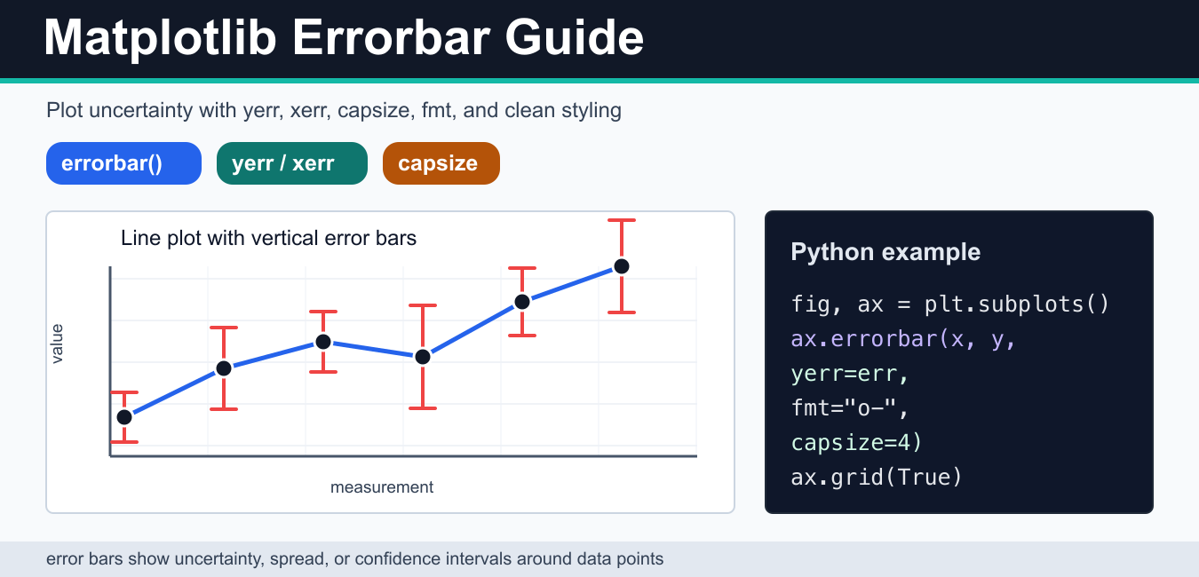
Quick answer: Use ax.errorbar(x, y, yerr=…, xerr=…) to show uncertainty around measurements. Choose symmetric or two-sided errors, set capsize for visible caps, and label the statistic and units so the error bar communicates more than decoration.
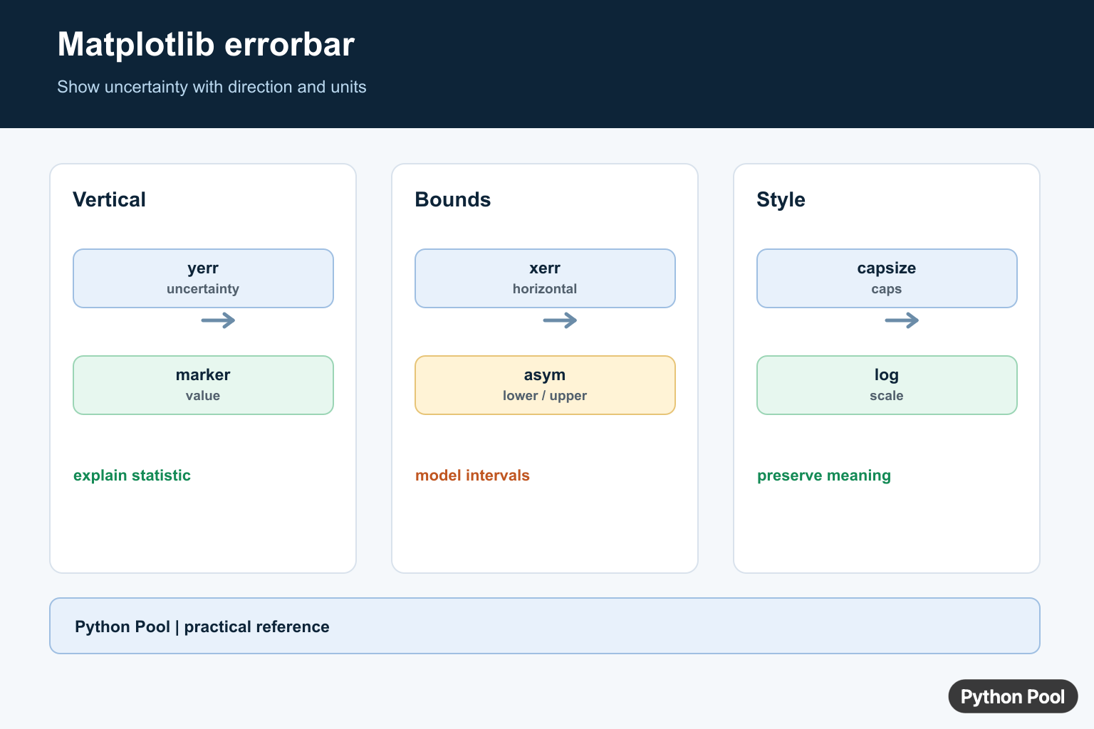
A Matplotlib errorbar plot shows a data point and the uncertainty around that point in the same chart. Use it when a value is an estimate, a mean, a measurement with tolerance, or a result that needs a confidence interval. The most important arguments are yerr for vertical error bars, xerr for horizontal error bars, fmt for the marker and line style, and capsize for the small caps at the end of each bar.
Most examples should use the object-oriented Matplotlib API: create a figure and axes with plt.subplots(), then call Axes.errorbar(). This keeps the code easier to extend when you add a grid, custom ticks, labels, annotations, or save the finished chart.
Basic Matplotlib errorbar example
The simplest errorbar chart passes the x values, y values, and a matching list of vertical errors. In this example, each point has its own error amount. The fmt="o-" argument draws circular markers connected by a line, while capsize=4 makes the uncertainty easier to read.
import matplotlib.pyplot as plt

x = [1, 2, 3, 4, 5]
y = [2.1, 2.7, 3.4, 3.1, 4.0]
err = [0.2, 0.3, 0.25, 0.35, 0.28]

fig, ax = plt.subplots()
ax.errorbar(x, y, yerr=err, fmt="o-", capsize=4)
ax.set_xlabel("Trial")
ax.set_ylabel("Mean score")
ax.grid(True, alpha=0.3)
plt.show()
If the grid becomes visually heavy, tune it rather than removing useful context. The Matplotlib grid guide covers line style, alpha, axis-specific grid lines, and other small adjustments that make uncertainty charts easier to scan.
Use yerr for vertical uncertainty
Use yerr when the uncertainty belongs to the y value. This is common for means, scores, measurements, experiment results, and model estimates. The error can be a single number applied to every point, a list with one value per point, or a pair of lists for lower and upper error sizes.
For a quick chart, a symmetric list is enough. Each item in yerr is drawn above and below the corresponding y value. Keep the error values positive; Matplotlib treats them as distances from the data point, not as final y coordinates.
Use xerr for horizontal error bars
Use xerr when the uncertainty belongs to the x value. This is useful for timing ranges, sensor tolerance, binned measurements, or any chart where the horizontal position is an estimate. You can combine xerr and yerr in the same call if both dimensions have uncertainty.
import matplotlib.pyplot as plt

x = [10, 20, 30, 40]
y = [1.2, 1.7, 2.1, 2.8]
xerr = [1.5, 2.0, 1.2, 2.5]

fig, ax = plt.subplots()
ax.errorbar(x, y, xerr=xerr, fmt="s", capsize=3, linestyle="none")
ax.set_xlabel("Duration (ms)")
ax.set_ylabel("Sample group")
plt.show()
When labels become crowded on the x-axis, adjust them directly with tick controls instead of rotating every label by habit. The Matplotlib xticks tutorial shows how to set locations, labels, rotation, and font size.
Asymmetric error bars
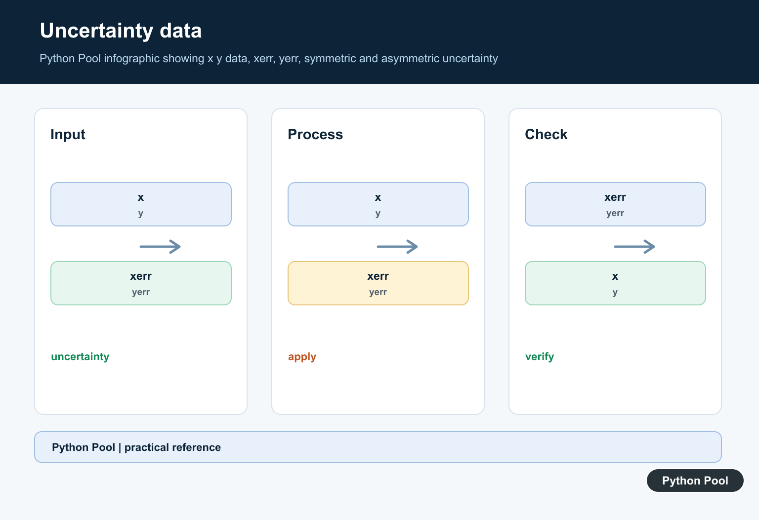
Real uncertainty is not always symmetrical. Matplotlib accepts a two-row structure for asymmetric errors: the first row gives the lower error distance and the second row gives the upper error distance. This is especially helpful for confidence intervals, percentile bands, and measurements where the lower and upper ranges differ.
import matplotlib.pyplot as plt

x = [1, 2, 3, 4]
y = [12, 18, 17, 24]
lower = [1.5, 2.0, 1.0, 3.0]
upper = [2.5, 1.0, 2.8, 4.0]

fig, ax = plt.subplots()
ax.errorbar(x, y, yerr=[lower, upper], fmt="o", capsize=5)
ax.set_ylabel("Response time")
plt.show()
If the vertical range hides the differences between points, set the y-axis deliberately instead of accepting the default limits. The Matplotlib ylim guide explains how to control the visible range without distorting the meaning of the chart.
Style error bars with capsize, ecolor, and elinewidth
Error bars should be visible but not louder than the data. Use ecolor to set the error bar color, elinewidth for bar thickness, capsize for cap length, and marker options for the data points. A common pattern is to keep the data line dark and use a contrasting but restrained color for the uncertainty.
import matplotlib.pyplot as plt

x = [1, 2, 3, 4, 5]
y = [5.4, 5.9, 6.6, 6.2, 7.1]
yerr = [0.4, 0.5, 0.35, 0.6, 0.45]

fig, ax = plt.subplots()
ax.errorbar(
    x,
    y,
    yerr=yerr,
    fmt="o-",
    color="#1f2937",
    ecolor="#ef4444",
    elinewidth=2,
    capsize=5,
    markerfacecolor="white",
    markeredgewidth=2,
)
ax.set_title("Styled error bars")
plt.show()
For multi-series charts, use a legend and a consistent color system. If the chart depends on continuous values, the Matplotlib colormap guide can help you choose a readable palette. If the chart needs callouts, the Matplotlib annotate tutorial shows how to label a specific point without adding clutter.
Error bars on bar charts
Error bars are not limited to line plots. Bar charts can show uncertainty too, but the final chart should still make the comparison obvious. If the bars are horizontal, use xerr; for vertical bars, use yerr. The Matplotlib barh guide is a useful companion when category labels are long or when horizontal bars make the result easier to read.
import matplotlib.pyplot as plt

labels = ["A", "B", "C"]
values = [14, 18, 15]
errors = [1.2, 2.0, 1.5]

fig, ax = plt.subplots()
ax.bar(labels, values, yerr=errors, capsize=6, color="#60a5fa")
ax.set_ylabel("Average result")
plt.show()
Log scales and readability
Error bars on a log scale need extra care because zero or negative lower bounds cannot be displayed on a logarithmic axis. Before calling set_yscale(), check that every displayed value and error range stays positive. For a broader explanation, see the Matplotlib log scale guide.
Save the finished errorbar chart
After the chart is readable on screen, export it with savefig(). Use a higher DPI for PNG output, and use bbox_inches="tight" when labels or titles sit close to the edge. The Matplotlib savefig guide covers PNG, PDF, SVG, transparent backgrounds, and common export issues.
import matplotlib.pyplot as plt

x = [1, 2, 3]
y = [4.2, 5.1, 5.8]
yerr = [0.3, 0.4, 0.2]

fig, ax = plt.subplots()
ax.errorbar(x, y, yerr=yerr, fmt="o-", capsize=4)
fig.savefig("errorbar-chart.png", dpi=160, bbox_inches="tight")
When not to use error bars
Do not add error bars only because they make a chart look more technical. If the uncertainty is unknown, explain the limitation in text. If there are many overlapping intervals, a confidence band, box plot, violin plot, or small multiples may be clearer. Also avoid mixing several meanings in one figure: standard deviation, standard error, and confidence interval are not interchangeable, so name the quantity in the caption, title, or axis label.
Layout also matters. Leave enough space around labels and legends, and adjust subplot spacing when multiple panels share one figure. The Matplotlib subplot spacing guide covers tight_layout(), subplots_adjust(), and related fixes.
Official Matplotlib references
- matplotlib.pyplot.errorbar
- matplotlib.axes.Axes.errorbar
- Errorbar limit selection gallery example
- matplotlib.pyplot.subplots
- matplotlib.axes.Axes.legend
- matplotlib.axes.Axes.set_yscale
- matplotlib.pyplot.savefig
Plot Vertical Uncertainty
yerr adds uncertainty in the y direction. The marker represents the measured value, while the vertical line communicates the error interval. Use an Axes object so labels, limits, and multiple series remain explicit.
import matplotlib.pyplot as plt

x = [1, 2, 3]
y = [2.0, 3.5, 2.8]
yerr = [0.2, 0.4, 0.15]

fig, ax = plt.subplots()
ax.errorbar(x, y, yerr=yerr, fmt="o-", capsize=4)
ax.set_xlabel("trial")
ax.set_ylabel("value")
plt.show()
Add Horizontal Or Asymmetric Errors
Pass xerr for horizontal uncertainty. A two-row error array represents lower and upper errors separately, which is useful for confidence intervals or measurements with a non-symmetric bound.
import matplotlib.pyplot as plt
import numpy as np

x = np.array([1, 2, 3])
y = np.array([4.0, 5.0, 4.5])
yerr = np.array([[0.3, 0.2, 0.4], [0.5, 0.4, 0.6]])
xerr = np.array([0.1, 0.2, 0.1])

fig, ax = plt.subplots()
ax.errorbar(x, y, xerr=xerr, yerr=yerr, fmt="s", capsize=3)
plt.show()
Style The Error Bars
Set ecolor, elinewidth, capsize, capthick, and alpha to keep uncertainty visible without overpowering the measured series. If multiple series use different units or uncertainty definitions, explain the distinction in the legend or caption.
import matplotlib.pyplot as plt

fig, ax = plt.subplots()
ax.errorbar(
    [1, 2, 3], [2, 4, 3], yerr=[0.4, 0.7, 0.3],
    fmt="o", color="#1f77b4", ecolor="#d62728",
    elinewidth=1.5, capsize=5, alpha=0.9,
)
plt.show()
Use Error Bars On Log Scales Carefully
Error intervals must remain meaningful in the plotted coordinate system. On a log axis, symmetric additive errors can cross zero or visually misrepresent multiplicative uncertainty. Compute bounds from the underlying measurement model and validate the plotted limits.
import matplotlib.pyplot as plt

values = [1, 10, 100]
lower = [0.8, 8, 80]
upper = [1.3, 13, 130]
yerr = [[values[i] - lower[i] for i in range(3)], [upper[i] - values[i] for i in range(3)]]

fig, ax = plt.subplots()
ax.set_yscale("log")
ax.errorbar([1, 2, 3], values, yerr=yerr, fmt="o", capsize=4)
plt.show()
Matplotlib’s official errorbar() reference documents xerr, yerr, asymmetric arrays, caps, styles, and log-axis behavior.
For presentation details around uncertainty plots, compare Matplotlib grid lines, figure sizing, and plot annotations when making error bars readable at different output sizes.
Frequently Asked Questions
How do I add error bars in Matplotlib?
Call ax.errorbar(x, y, yerr=errors) and configure the marker and line style for the measured values.
How do I add horizontal error bars?
Pass xerr for uncertainty in the x direction; use both xerr and yerr when both coordinates have uncertainty.
How do I draw asymmetric error bars?
Pass a two-row array where the first row contains lower errors and the second row contains upper errors.
What does capsize do in errorbar()?
capsize controls the length of the small end caps drawn across each error bar, measured in points.