Hello geeks and welcome in this article, we will cover Matplotlib Annotate. Along with that, for an overall better understanding, we will also look at its syntax and parameter. Then we will see the application of all the theory part through a couple of examples.
First, let us try to develop a brief understanding of Matplotlib Annotate. But before that, I will give you an overview of the Matplotlib library. It is the plotting library of Python and an extension to the NumPy library. With this library’s help, we plot different graphs justifying our programs. It comes very handy when dealing with writing programs for data science.
Now coming back to our function Matplotlib Annotate. So, in general, the term annotate means to label something. Suppose you draw a VI characteristic graph in this, you label the x-axis as V(voltage) and the y-axis as I(current). Similarly, the function helps us label graphs generated with the help of matplotlib. It will become more clear as we discuss a few examples. But before that, in the next section, we will be looking at its syntax.
Syntax
matplotlib.pyplot.annotate()This is the general syntax of our function. It has several parameters associated with it, which we will be covering in the next section.
PARAMETER
1. text
This parameter represents the text that we want to annotate.
2. xy
This parameter represents the Point X and Y to annotate.
3. XYText
An optional parameter represents the position where the text along X and Y needs to be placed.
4. XYCOORDS
This parameter contains the string value.
5. ARROWPROPS
This parameter is also an optional value and contains “dict” type. By default it is none.
EXAMPLES
As we are done with all the theory portion related to Matplotlib Annotate. In this section, we will be looking at how this function works and how it helps us achieve our desired output. We will start with an elementary level example and gradually move our way to more complicated examples.
1. Sine waveform
import matplotlib.pyplot as plt
import numpy as pp

fig, ppool = plt.subplots()

t = pp.arange(0.0, 1.0, 0.001)
s = pp.sin(2 * pp.pi * t)
line = ppool.plot(t, s, lw=2)

ppool.annotate('Peak Value', xy=(.25, 1),
                xytext=(1, 1),arrowprops=dict(facecolor='yellow',
                                shrink=0.05),xycoords="data",)

ppool.set_ylim(-1.5, 1.5)
plt.show()
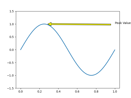
Above we can see the very first example for our function. Here our goal is to print the sine waveform. In order to do so, we have first imported the NumPy and matplotlib library. Then after which we have used the arange function of Numpy. So what it does that the function automatically generates a value between the specified range. After which we have used the sine function 2*pi*t. After which comes our annotation part. Here XY is the point where the arrow needs to mark. Along with that, we have arrow props that contain all the data about how the arrow look. We have also used XY text and coords. Then we have specified the y-axis-limit. At last, we have plotted it.
2. Full-wave rectifier from cosine signal
import matplotlib.pyplot as plt
import numpy as pp

fig, ppool = plt.subplots()

t = pp.arange(0.0, 1.0, 0.001)
s = pp.cos(2 * pp.pi * 5 * t)
line = ppool.plot(t, s, lw=2)

# Annotation
ppool.annotate('Peak Values', xy=(0, 1),
                xytext=(1, 1),arrowprops = dict(facecolor ='green',
                                  shrink = 0.05),xycoords="data",)
plt.xlabel("Time")
plt.ylabel("output Voltage")

ppool.set_ylim(-1, 1)

# Plot the Annotation in the graph
plt.show()
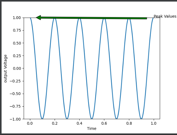
In this example, we have our goal is to print the output of a full-wave rectifier for cosine signal. Here the peak to peak value is -1 to 1. The frequency of the given cosine signal is 5 Hz. Here apart from the above-mentioned things we have used a plt label. What it does is that it gives us the freedom to label the 2 axes as well.
Different application
1. Annotate Scatter Plot
We annotate a scatter plot using this method let us look at an example.
import matplotlib.pyplot as plt
y = [3.2, 3.9, 3.7, 3.5, 3.02199]
x = [0.15, 0.3, 0.45, 0.6, 0.75]
n = [155, "outliner", 293, 230, 670]

fig, ax = plt.subplots()
ax.scatter(x, y)

for i, txt in enumerate(n):
    ax.annotate(txt, (x[i], y[i]))
plt.show()
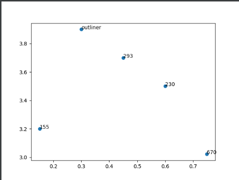
Here above in order to plot the scatter plot. At first, we have defined the coordinates along the x and y-axis. Now corresponding to each point we have declared the notations. Then we have used the for loop to automatically get the annotation value for each point.
2. Annotate Bar chart
import matplotlib.pyplot as plt
import numpy as np


labels = ['Mon', 'Tue', 'Wed', 'Thu', 'Fri']
shop_a = [20, 33, 30, 28, 27]
shop_b = [25, 32, 33, 20, 25]

x = np.arange(len(labels))
width = 0.35  # the width of the bars

fig, ax = plt.subplots()
rects1 = ax.bar(x - width/2, shop_a, width, label='Sales-a')
rects2 = ax.bar(x + width/2, shop_b, width, label='sales-b')


ax.set_ylabel('Sales')
ax.set_title('Sales report of 2 shops')
ax.set_xticks(x)
ax.set_xticklabels(labels)
ax.legend()


def autolabel(rects):
    for rect in rects:
        height = rect.get_height()
        ax.annotate('{}'.format(height),
                    xy=(rect.get_x() + rect.get_width() / 2, height),
                    xytext=(0, 3),
                    textcoords="offset points", size=16,color="Green",
                    ha='center', va='bottom')


autolabel(rects1)
autolabel(rects2)

fig.tight_layout()

plt.show()
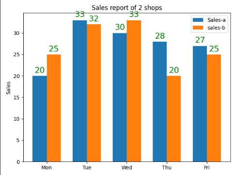
Here we have successfully performed annotation for the Bar graph. Here the graph is a comparison between the product sold by 2 shops from Monday to Friday. Another thing to pay attention is that we have customized the size and colour of the annotated text. You can simply do so by adding the color=” ” and size=” ” in annotating tag.
Error-matplotlib annotate not showing
This error occurs may occur with you when working with this function. The primary reason can be some error in your code. One of the most common mistakes is that the position of the annotation text is way above your concerned axes. In this case, the annotate will be there but you can’t see it due to size difference.
Must Read
- Working With Matplotlib Text in Python
- Python Spectrogram Implementation in Python from scratch
- Convert Text File to PDF Using Python | FPDF
Conclusion
In this article, we covered the Matplotlib Annotate. Besides that, we have also looked at its syntax and parameters. For better understanding, we looked at a couple of examples. We varied the syntax and looked at the output for each case. In the end, we can conclude that function Matplotlib Annotate is used to annotate graphs generated by Matplotlib.
I hope this article was able to clear all doubts. But in case you have any unsolved queries feel free to write them below in the comment section. Done reading this why not read about argpartition next.
