
Quick answer: Matplotlib ylim sets or reads the visible y-axis interval. Choose limits from the data and the chart’s purpose, preserve automatic scaling when appropriate, and make intentional clipping clear so readers do not mistake a cropped chart for the full range.
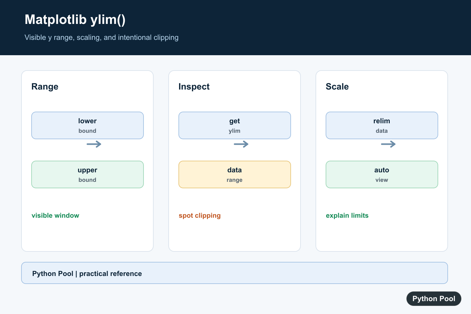
matplotlib.pyplot.ylim() gets or sets the y-axis limits of the current Axes. In modern Matplotlib code, the object-oriented form ax.set_ylim() is usually clearer because it changes a specific Axes instead of whichever Axes is currently active.
Use y-limits when you need to zoom into a value range, compare multiple plots on the same scale, reserve space for annotations, or reverse a vertical axis such as depth.
Recommended syntax with ax.set_ylim
import numpy as np
import matplotlib.pyplot as plt

x = np.linspace(0, 10, 300)
y = np.sin(x)

fig, ax = plt.subplots()
ax.plot(x, y)
ax.set_ylim(-1.5, 1.5)
plt.show()
ax.set_ylim(-1.5, 1.5) sets the bottom and top of the y-axis in data coordinates. The method returns the new (bottom, top) limits.
Using pyplot ylim
The pyplot version is shorter and works well for simple scripts:
import matplotlib.pyplot as plt

plt.plot([1, 2, 3], [10, 40, 20])
plt.ylim(0, 50)
plt.show()
Calling plt.ylim() with no arguments returns the current y-limits. Calling it with values sets the limits on the current Axes.
bottom, top = plt.ylim()
print(bottom, top)
Set only the bottom or top limit
You do not always need to set both sides. Use keyword arguments to leave one side unchanged:
fig, ax = plt.subplots()
ax.plot([1, 2, 3], [4, 9, 6])

ax.set_ylim(bottom=0)   # keep the current top limit
ax.set_ylim(top=12)     # keep the current bottom limit
plt.show()
The official Axes.set_ylim() documentation also says passing None leaves that limit unchanged:
ax.set_ylim(0, None)    # set bottom, keep top unchanged
ax.set_ylim(None, 100)  # keep bottom unchanged, set top
Get the current y-axis limits
Use ax.get_ylim() when you need the current range before calculating a new one:
fig, ax = plt.subplots()
ax.plot([1, 2, 3], [2, 8, 5])

bottom, top = ax.get_ylim()
padding = (top - bottom) * 0.1
ax.set_ylim(bottom - padding, top + padding)
This pattern is useful when you want a little extra space above or below plotted data.
Reverse the y-axis
Matplotlib allows the bottom value to be greater than the top value. That reverses the y-axis:
import matplotlib.pyplot as plt

depth = [0, 100, 500, 1000, 2000]
temperature = [22, 18, 10, 5, 2]

fig, ax = plt.subplots()
ax.plot(temperature, depth)
ax.set_ylim(2000, 0)
ax.set_xlabel("Temperature")
ax.set_ylabel("Depth")
plt.show()
This is common for depth, pressure, ranking, and other vertical scales where larger numeric values should appear lower on the plot. For general list reversal in Python, see Python reverse list examples.
Y-limits and autoscaling
Setting explicit limits turns off y-axis autoscaling for that Axes. If you later add more data, Matplotlib may not expand the y-axis automatically because you fixed the limits.
fig, ax = plt.subplots()
ax.plot([1, 2, 3], [1, 2, 3])
ax.set_ylim(0, 4)

ax.plot([1, 2, 3], [10, 20, 30])  # may be outside the visible y-range
If you want Matplotlib to calculate limits again, call ax.autoscale(axis="y") or set new limits after adding all data.
Set matching y-limits across subplots
Using the same y-range across subplots makes visual comparison easier:
import numpy as np
import matplotlib.pyplot as plt

x = np.linspace(0, 10, 300)
fig, axes = plt.subplots(2, 1, sharex=True)

axes[0].plot(x, np.sin(x))
axes[1].plot(x, 2 * np.sin(x))

for ax in axes:
    ax.set_ylim(-2.2, 2.2)

plt.show()
If axis scaling is part of the comparison, keep the limits explicit and documented.
ylim with log-scale plots
When the y-axis uses a logarithmic scale, the y-limits must be positive:
fig, ax = plt.subplots()
ax.semilogy([1, 2, 3, 4], [1, 10, 100, 1000])
ax.set_ylim(1, 2000)
plt.show()
For more scale examples, read our Matplotlib log scale guide.
Common mistakes
Using plt.ylim() in multi-plot code: It affects the current Axes. Use ax.set_ylim() when a figure has multiple Axes.
Expecting autoscale after fixed limits: Setting limits turns off y-axis autoscaling. Set limits after adding data or call autoscale again.
Reversed limits by accident: ax.set_ylim(10, 0) is valid and reverses the y-axis. If the plot looks upside down, check the order.
Negative limits on log scale: A logarithmic y-axis cannot show zero or negative values.
Official references
- Matplotlib documentation for
pyplot.ylim() - Matplotlib documentation for
Axes.set_ylim() - Matplotlib documentation for
Axes.get_ylim()
Conclusion
Use ax.set_ylim(bottom, top) to control the y-axis range of a specific Matplotlib Axes. Use ax.get_ylim() to read the current limits, keyword arguments or None to change only one side, and reversed limit order when you intentionally want an inverted y-axis. For quick one-plot scripts, plt.ylim() remains a convenient wrapper around the current Axes.
Set Both Bounds
Use a lower and upper bound when the chart has a meaningful fixed range, such as a percentage or a shared comparison across multiple plots.
import matplotlib.pyplot as plt

fig, ax = plt.subplots()
ax.plot([0, 1, 2], [10, 14, 12])
ax.set_ylim(0, 20)
print(ax.get_ylim())
Set One Bound With The Axes API
The pyplot form is convenient for the current axes, while the object-oriented API makes the target explicit. Read the existing bound before changing only one side.
import matplotlib.pyplot as plt

fig, ax = plt.subplots()
ax.plot([0, 1, 2], [10, 14, 12])
lower, upper = ax.get_ylim()
ax.set_ylim(bottom=0, top=upper)
print(ax.get_ylim())
Avoid Hiding Data Accidentally
Points outside the interval remain in the data but disappear from the view. Compare the limits with the data range and annotate intentional clipping.
import matplotlib.pyplot as plt

values = [2, 4, 12]
fig, ax = plt.subplots()
ax.plot(values)
ax.set_ylim(0, 10)
if max(values) > ax.get_ylim()[1]:
    print("upper values are clipped")
Restore Automatic Scaling
After adding or changing plotted data, relim and autoscale_view can recalculate the view. Use the axes object so the operation affects the intended subplot.
import matplotlib.pyplot as plt

fig, ax = plt.subplots()
ax.plot([0, 1], [2, 3])
ax.set_ylim(0, 10)
ax.plot([2, 3], [20, 25])
ax.relim()
ax.autoscale_view()
print(ax.get_ylim())
Choose Limits That Explain The Data
Axis limits are part of a chart’s meaning, not only a cosmetic setting. For a time series, include enough context to show the baseline and the important movement. For a comparison chart, use the same y-axis limits across panels when visual comparison is intended. For percentages, a zero baseline may be important, but forcing zero on every scientific plot can make small changes unreadable. State the choice in the caption or annotation when the visible range is deliberately constrained.
After plotting additional data, remember that a manually fixed limit remains fixed until it is changed. This can make a later series appear to vanish even though it is present. A test can compare the plotted data range with get_ylim and flag unexpected clipping. Matplotlib’s ylim() and Axes.set_ylim() references cover limits and the axes API. Related references include saving figures, subplot layout, and chart annotations.
For related chart controls, compare saving figures, subplot layout, and chart annotations when presenting a bounded axis.
Frequently Asked Questions
What does plt.ylim do?
It sets or reads the lower and upper limits of the current Matplotlib y-axis.
How do I set only one y limit?
Use the axes API with the existing bound when only the lower or upper limit should change.
Why is data missing after setting ylim?
Points outside the chosen interval are clipped from view even though they remain in the underlying data.
How do I restore automatic y-axis scaling?
Set the limits back to automatic behavior with the axes API or call relim and autoscale_view after changing plotted data.