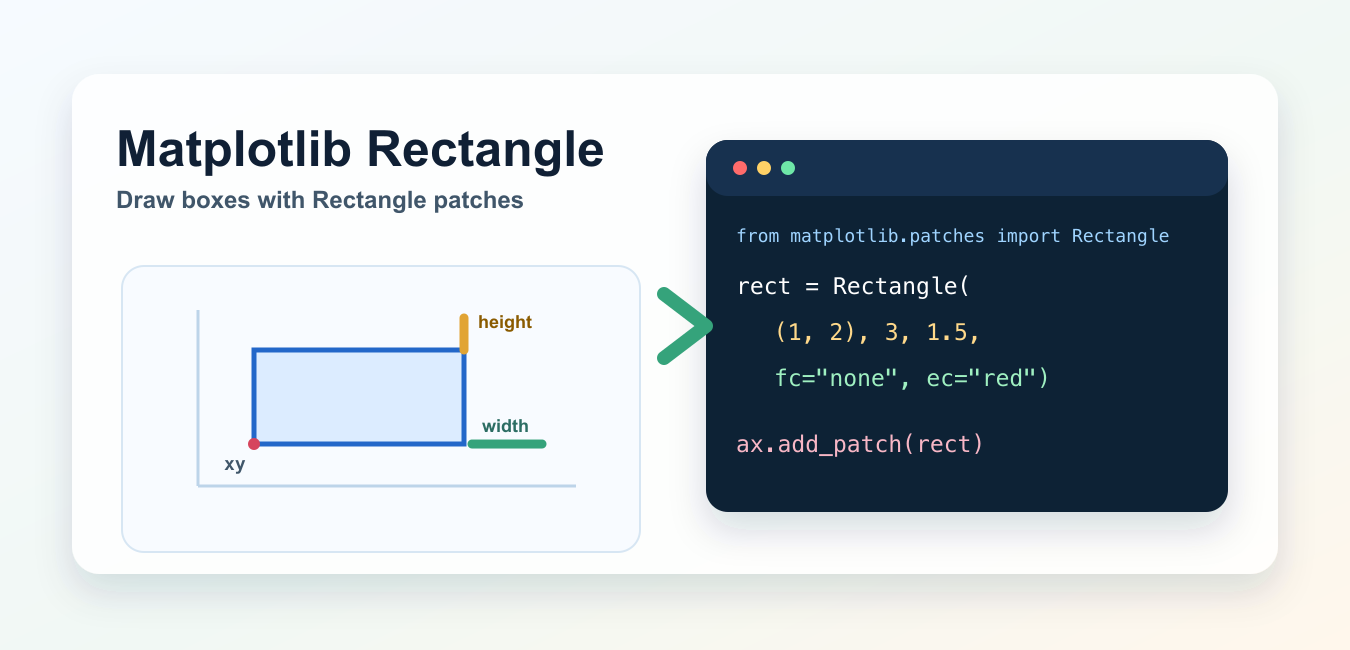
Quick answer: Create a matplotlib.patches.Rectangle with an (x, y) anchor, width, and height, then call ax.add_patch(rect). The values use the axes data coordinate system by default. Set limits for standalone examples, use facecolor=’none’ for an outline, and choose zorder, alpha, and rotation deliberately so the patch explains rather than hides the data.
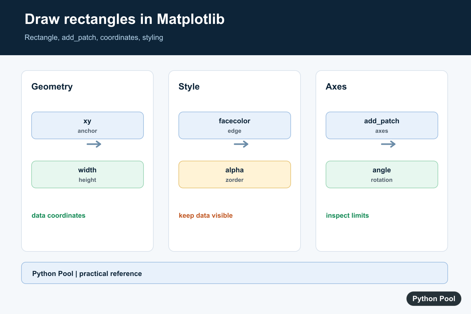
To draw a rectangle in Matplotlib, create a matplotlib.patches.Rectangle object and add it to an axes with ax.add_patch(). A rectangle is defined by an anchor point xy, a width, and a height.
This guide shows the practical patterns: drawing a rectangle on a blank axes, highlighting points in a scatter plot, placing a box over an image, rotating a rectangle, and avoiding common axis-limit mistakes. Matplotlib is not installed in this local environment, so the examples were syntax-checked and aligned with the official Matplotlib documentation rather than rendered here.
Basic rectangle with Rectangle and add_patch()
The xy argument gives the rectangle anchor point. With normal x/y axes, you can think of it as the lower-left corner.
import matplotlib.pyplot as plt
from matplotlib.patches import Rectangle

fig, ax = plt.subplots()

rect = Rectangle(
    (1, 2),
    3,
    1.5,
    facecolor="none",
    edgecolor="red",
    linewidth=2,
)

ax.add_patch(rect)
ax.set_xlim(0, 5)
ax.set_ylim(0, 5)
ax.set_aspect("equal")
plt.show()
Rectangle((1, 2), 3, 1.5) starts at (1, 2), extends 3 units along the x-axis, and extends 1.5 units along the y-axis. facecolor="none" makes the rectangle transparent inside, while edgecolor and linewidth style the border.
Rectangle parameters that matter
The most important constructor parameters are xy, width, height, angle, and rotation_point. Styling options come from Matplotlib’s general Patch properties, including facecolor, edgecolor, linewidth, linestyle, alpha, and zorder.
If your rectangle does not appear, check the axis limits first. A patch can exist but be outside the visible x/y range. Explicitly setting ax.set_xlim() and ax.set_ylim() keeps the example predictable. For more on drawing order, see Matplotlib zorder.
Draw a rectangle around scatter points
Rectangles are often used to highlight a region of interest on an existing plot.
import matplotlib.pyplot as plt
from matplotlib.patches import Rectangle

x = [1, 2, 3, 4]
y = [2, 3, 1, 4]

fig, ax = plt.subplots()
ax.scatter(x, y)

highlight = Rectangle(
    (1.5, 1.5),
    2.0,
    2.0,
    facecolor="none",
    edgecolor="orange",
    linewidth=2,
)
ax.add_patch(highlight)

plt.show()
The rectangle uses the same data coordinates as the scatter plot. If the box should appear above other artists, pass a higher zorder. If you need arrows or text labels for the highlighted area, see Matplotlib annotate().
Draw a rectangle on an image
When you show an image with imshow(), you can add a rectangle patch to mark a region. This is common for bounding boxes and visual inspection.
import matplotlib.pyplot as plt
from matplotlib.patches import Rectangle

fig, ax = plt.subplots()
ax.imshow(image)

box = Rectangle(
    (40, 30),
    120,
    80,
    facecolor="none",
    edgecolor="lime",
    linewidth=2,
)
ax.add_patch(box)

plt.show()
Here, (40, 30) is the box anchor in image coordinates, and the width and height are measured in the same coordinate system used by the axes. For image loading basics, see Matplotlib imread.
Draw a rotated rectangle
Use angle to rotate a rectangle. Recent Matplotlib versions also support rotation_point, which controls whether rotation happens around the anchor point, the center, or a custom point.
import matplotlib.pyplot as plt
from matplotlib.patches import Rectangle

fig, ax = plt.subplots()

rect = Rectangle(
    (1, 1),
    3,
    1,
    angle=25,
    rotation_point="center",
    facecolor="none",
    edgecolor="purple",
)
ax.add_patch(rect)
ax.set_xlim(0, 5)
ax.set_ylim(0, 4)

plt.show()
If you are building diagrams with multiple shapes, keep related axis settings near the patch code. For circles and other patch-like shapes, see drawing circles in Matplotlib.
Filled vs outline rectangles
For a filled rectangle, pass a visible facecolor. For an outline only, use facecolor="none". Use alpha when the rectangle should overlay data without hiding it.
filled = Rectangle((0, 0), 2, 1, facecolor="steelblue", alpha=0.3)
outline = Rectangle((0, 1.5), 2, 1, facecolor="none", edgecolor="black")
Matplotlib patches are flexible, but keep the plot readable. Too many filled patches can hide the data you are trying to explain. For layout cleanup after labels and annotations, see Matplotlib tight_layout().
Common mistakes
The most common mistake is creating a Rectangle but never adding it to the axes. Always call ax.add_patch(rect).
The second common mistake is forgetting axis limits. If the rectangle coordinates are outside the current view, it will not be visible. Set xlim and ylim when creating standalone examples.
Also remember that width and height are in data coordinates. A rectangle on an image, a scatter plot, and a regular x/y plot all use the coordinate system of the axes. For related axis control, see Matplotlib aspect ratio and Matplotlib ylim.
Official references
The examples here follow the Matplotlib documentation for matplotlib.patches.Rectangle, Axes.add_patch(), Patch properties, Axes.imshow(), and Axes.set_aspect().
Conclusion
Use Rectangle plus ax.add_patch() to draw rectangles in Matplotlib. Start with xy, width, and height, style the patch with color and line options, set axis limits when needed, and use angle or rotation_point for rotated boxes.
Understand xy, Width, And Height
Rectangle takes its lower-left anchor and dimensions in the current axes coordinate system. For a plot with dates, categories, or image pixels, confirm what the axes coordinates mean before choosing the box dimensions.
import matplotlib.pyplot as plt
from matplotlib.patches import Rectangle

fig, ax = plt.subplots()
rect = Rectangle((1, 2), width=3, height=1.5)
ax.add_patch(rect)
ax.set_xlim(0, 5)
ax.set_ylim(0, 5)
plt.show()
Use An Outline For Highlighting
An outline is often clearer than a translucent fill when the rectangle surrounds existing points. Set facecolor=’none’, pick a contrasting edge color, and keep the line width large enough for the final export size.
from matplotlib.patches import Rectangle

highlight = Rectangle((1, 1), 2, 2, facecolor="none", edgecolor="crimson", linewidth=2, zorder=3)
ax.add_patch(highlight)
Rotate Around The Intended Point
The angle is applied to the patch, and supported Matplotlib versions provide rotation_point for choosing the pivot. Keep the axis limits generous enough to include the rotated corners, otherwise a valid rectangle can look clipped or missing.
from matplotlib.patches import Rectangle

rotated = Rectangle((1, 1), 3, 1, angle=25, rotation_point="center", facecolor="none")
ax.add_patch(rotated)
ax.set_xlim(0, 5)
ax.set_ylim(0, 4)
Keep Patches Readable Above Data
Use alpha for a filled region that should not hide the plot and zorder when the patch must sit above or below other artists. After adding patches, render the actual PNG or PDF and check that the legend, labels, and rectangle do not overlap.
from matplotlib.patches import Rectangle

region = Rectangle((2, 0), 1, 4, facecolor="gold", alpha=0.25, zorder=0)
ax.add_patch(region)
The implementation follows the official Rectangle reference and Axes.add_patch reference. For labels attached to a highlighted area, see Matplotlib annotate().
For related plot callouts and layering, compare Matplotlib annotate(), zorder control, and circle patches when marking a region without hiding the data.
Frequently Asked Questions
How do I draw a rectangle in Matplotlib?
Import Rectangle from matplotlib.patches, create it with an xy anchor, width, and height, then add it to an axes with ax.add_patch(rect).
Why is my Matplotlib rectangle not visible?
The patch may not have been added to the axes, or its data-coordinate bounds may be outside the current x and y limits.
How do I draw an outline-only rectangle?
Set facecolor=’none’ and choose an edgecolor and linewidth so the data underneath remains visible.
Can Matplotlib rectangles be rotated?
Yes. Pass angle and, on supported versions, rotation_point to control the orientation and pivot of the patch.
Great article!
I used your code to draw planes and works very good, almost as I needed.
I would like that intersections between vertical planes could be shown as a dashed line or suggested by a difference in colors. Is it posible to do that?
The code I’m using is as follows:
from mpl_toolkits.mplot3d import Axes3D
from mpl_toolkits.mplot3d.art3d import Poly3DCollection
import matplotlib.colors as colors
import matplotlib.pyplot as plt
def plano_xy(x0,y0,x1,y1,z):
return[(x0, y0, z),
(x1, y0, z),
(x1, y1, z),
(x0, y1, z)]
def plano_xz(x0,z0,x1,z1,y):
return[(x0, y, z0),
(x0, y, z1),
(x1, y, z1),
(x1, y, z0)]
def plano_yz(y0,z0,y1,z1,x):
return[(x, y0, z0),
(x, y0, z1),
(x, y1, z1),
(x, y1, z0)]
fig = plt.figure()
ax = Axes3D(fig)
verts=[]
x0=0
y0=0
z0=0
x1=1
y1=1
z1=0.4
verts.append(plano_xy(x0,y0,x1,y1,z0))
verts.append(plano_yz(y0,z0,y1,z1,x0))
verts.append(plano_yz(y0,z0,y1,z1,x1))
verts.append(plano_yz(y0,z0,x1,z1,1*(x0+x1)/3))
verts.append(plano_yz(y0,z0,x1,z1,2*(x0+x1)/3))
ax.add_collection3d(Poly3DCollection(verts, facecolors=’yellow’, linewidths=1, edgecolors=”gray”, alpha=1.0))
verts.append(plano_xz(x0,z0,x1,z1,y0))
verts.append(plano_xz(x0,z0,x1,z1,y1))
verts.append(plano_xz(x0,z0,x1,z1,1*(y0+y1)/3))
verts.append(plano_xz(x0,z0,x1,z1,2*(y0+y1)/3))
ax.add_collection3d(Poly3DCollection(verts, facecolors=’cyan’, linewidths=1, edgecolors=”gray”, alpha=0.5))
ax.set_xlabel(‘X’)
ax.set_ylabel(‘Y’)
ax.set_zlabel(‘Z’)
plt.show()
Hi,
Yes, I checked your code and it’s working perfectly fine. The thing which you mentioned about the intersection is very difficult to draw in Matplotlib.
Of course, you can draw it by using a line but it won’t work like other software like Autocad and most importantly it won’t be dynamic.
So, I suggest you create a function that solves the equation of two planes and calculates its equation. Then if the intersection exists, then draw a line graph by using ax.plot(x, y, z, label=’parametric curve’) where x, y, z are the array of coordinates of your line.
Regards,
Pratik
Great tutorial.
Q: how to draw a rectangle ONLY; not on a scatter, image or other objects?
Yes, you can draw a rectangle by using a dummy point. By default, if you try drawing a rectangle, it’ll not work. So, we’re going to work around it by placing a point in the graph and then drawing a rectangle. The point will be the rectangle’s xy coordinates. Following code will help you –
import matplotlib.pyplot as plt
from matplotlib.patches import Rectangle
fig, ax = plt.subplots()
rect_xy = [1,1]
ax.plot([rect_xy[0]],[rect_xy[1]])
ax.add_patch(Rectangle((rect_xy[0], rect_xy[1]), 2.3, 2.5, fc=’none’, color =’red’, linewidth = 2))
plt.show()
This will draw a rectangle on a clear matplotlib graph.
Regards,
Pratik