Matplotlib pcolormesh: X, Y, C Shapes and Shading
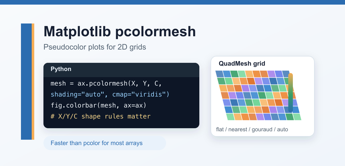
Use Matplotlib pcolormesh for 2D grids with correct X, Y, C dimensions, shading modes, colorbars, and uneven coordinate spacing.
Learn Matplotlib with tutorials for plots, labels, grids, colors, figures, legends, annotations, exports, and visualization examples in Python.
Use Matplotlib pcolormesh for 2D grids with correct X, Y, C dimensions, shading modes, colorbars, and uneven coordinate spacing.
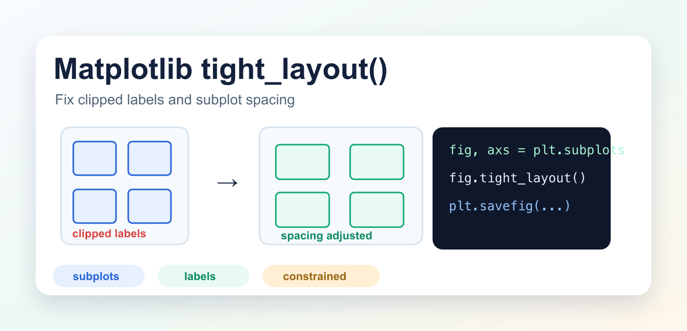
Make Matplotlib subplot spacing deliberate with tight_layout(), then inspect the saved figure for labels, legends, titles, and annotations.
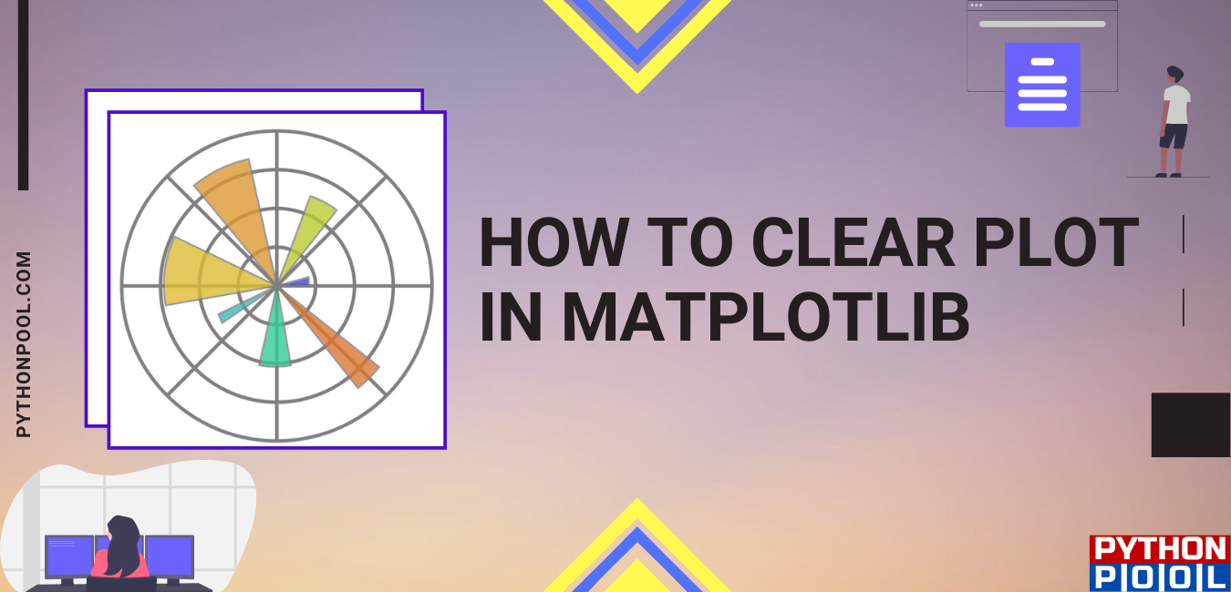
Clear Matplotlib axes and figures with ax.clear(), fig.clear(), plt.cla(), plt.clf(), and plt.close() without leaking plot resources.
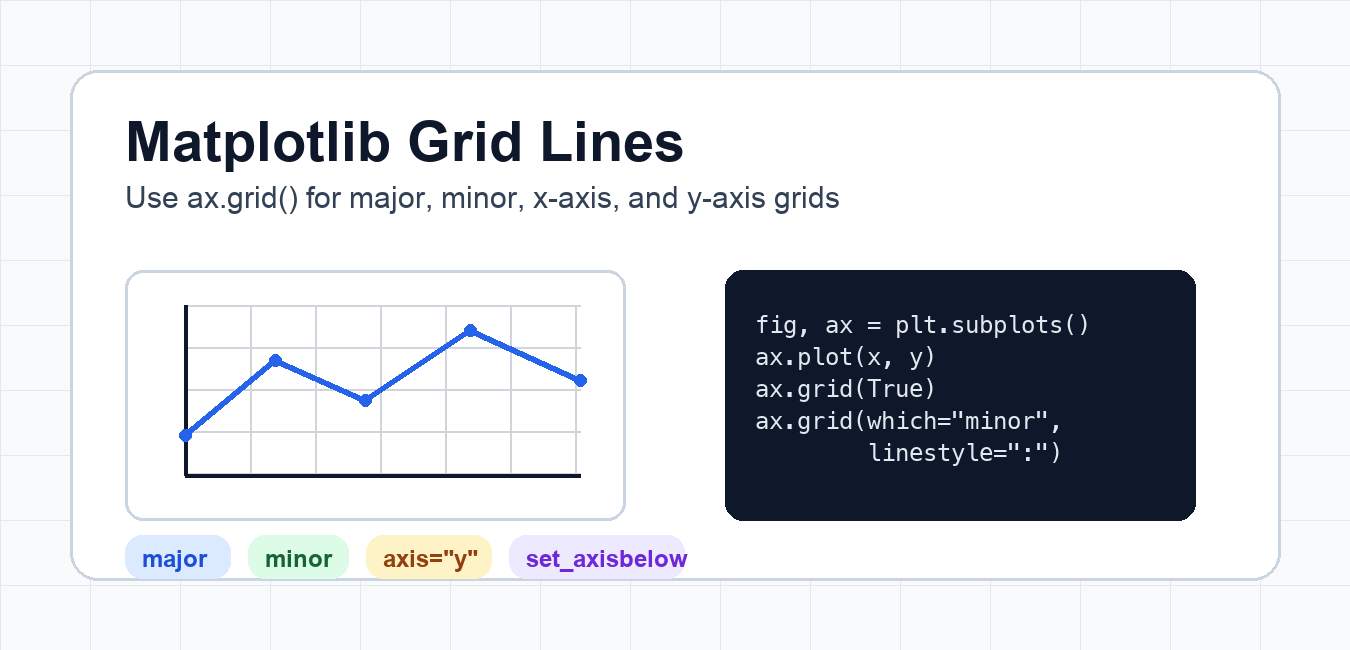
Use Matplotlib grid lines to support reading values, with deliberate major or minor ticks, axis selection, styling, and layering.
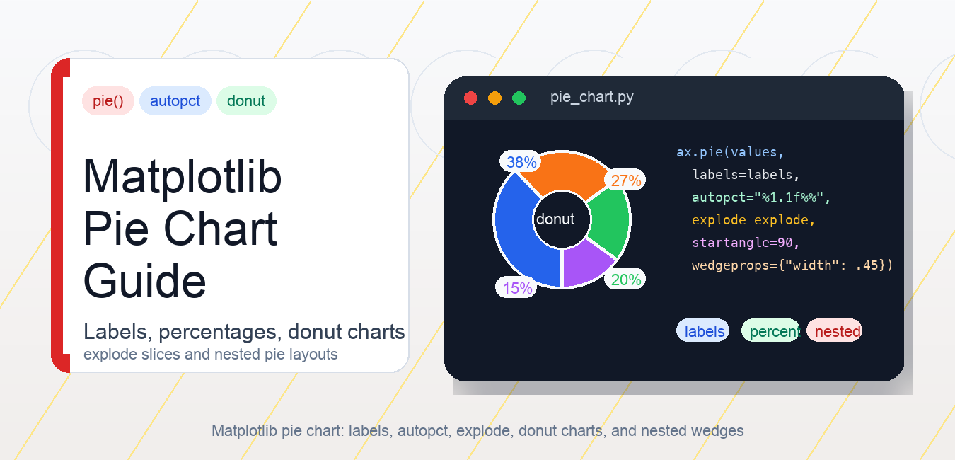
Create readable Matplotlib pie charts with labels, percentages, explode, donut wedges, legends, equal aspect, and better chart alternatives.
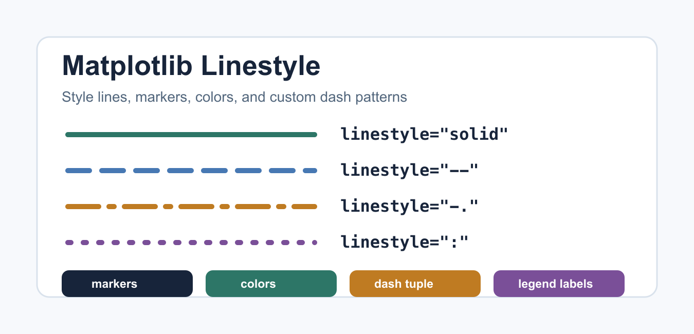
Use Matplotlib line patterns, weight, transparency, color, and markers together so plotted series remain clear after export and printing.
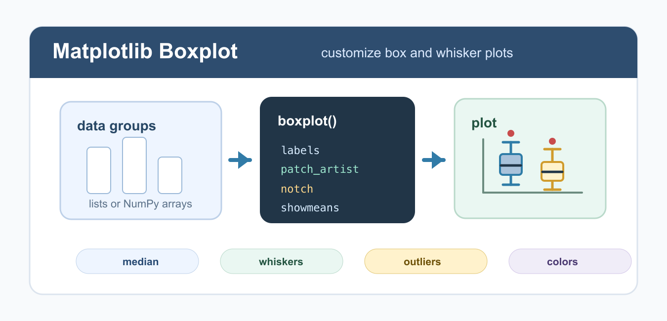
Learn Matplotlib boxplot customization in Python, including labels, colors, notches, horizontal plots, whiskers, outliers, means, and figure sizing.

Use Matplotlib ylim to set y-axis limits, inspect current bounds, preserve automatic scaling, and avoid hiding data with restrictive chart ranges.

Make Matplotlib log charts honest by matching the transform to the data domain and labeling the base, limits, ticks, and invalid values.
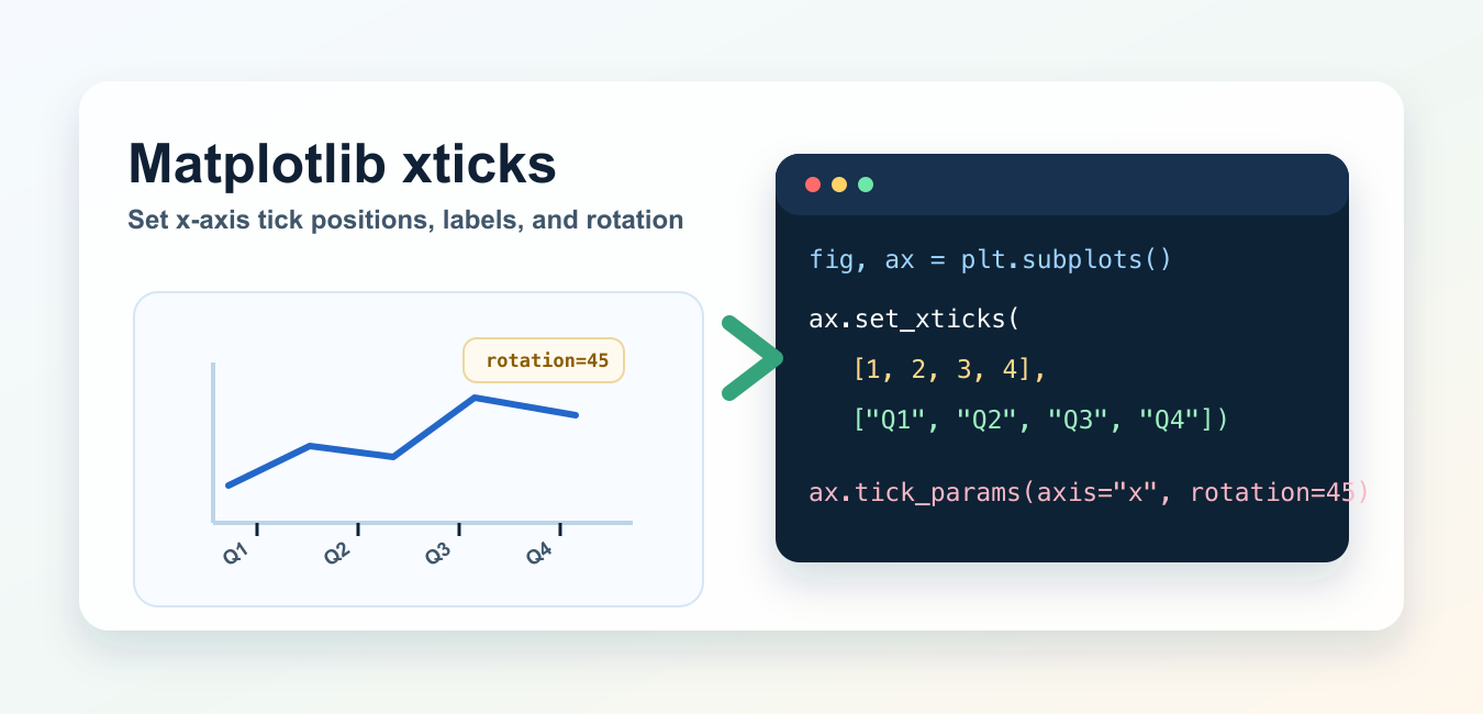
Control Matplotlib x-axis tick positions, labels, rotation, intervals, date ticks, and locator behavior with clear Axes examples.