Pigeonhole Sort in Python: Algorithm, Complexity, and Limits

Implement pigeonhole sort in Python, handle duplicates and negatives, analyze range-based complexity, and compare sorted().
Browse practical Python tutorials, error fixes, library guides, data science examples, and project ideas from Python Pool.
Implement pigeonhole sort in Python, handle duplicates and negatives, analyze range-based complexity, and compare sorted().
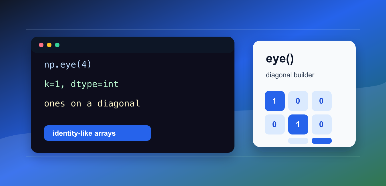
Use NumPy eye to create identity-like arrays with rows, columns, diagonal offsets, dtype control, and memory-aware initialization.

Use NumPy diff() for first and higher-order differences with axes, prepend, append, datetime values, booleans, and unsigned integers.
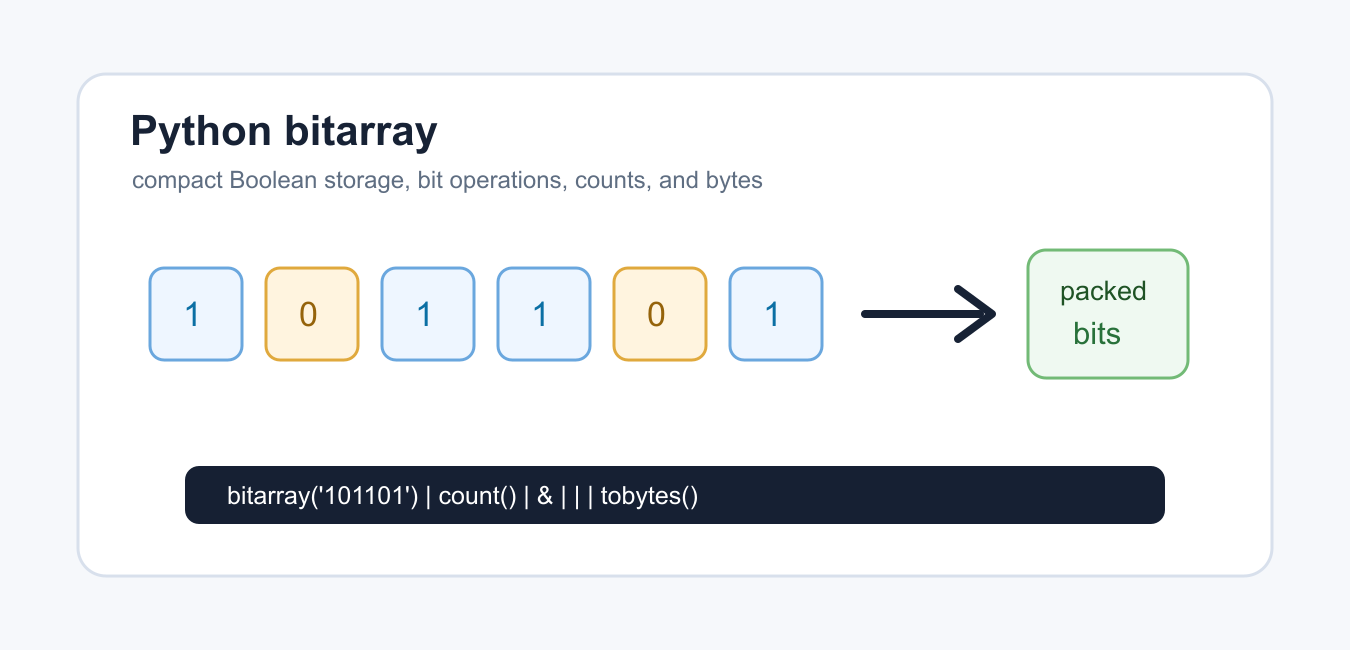
Use Python bitarray for compact Boolean storage, bitwise operations, counting, byte conversion, dependencies, and memory-aware design choices.

Understand strand sort in Python with sorted strands, stable merging, linked-list ideas, complexity tradeoffs, duplicate values, and practical alternatives.
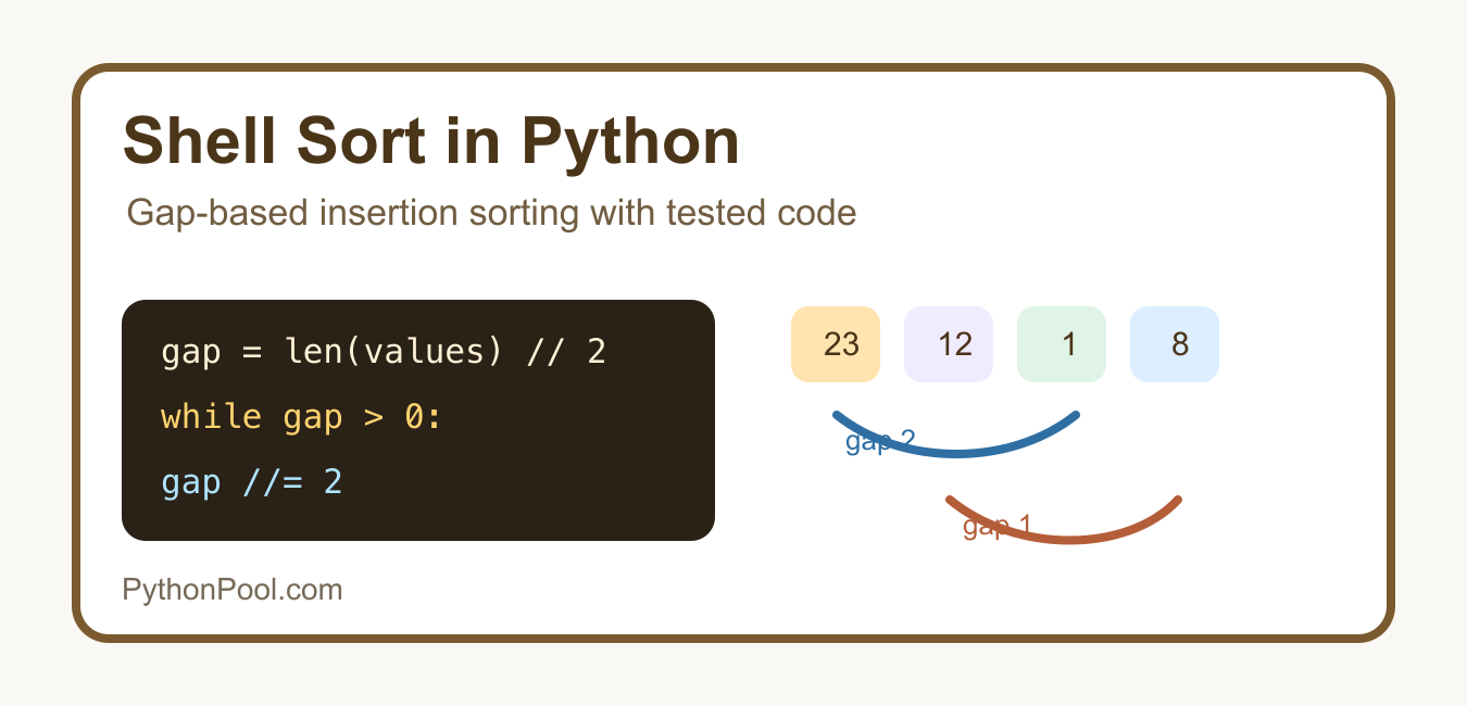
Understand Shell sort in Python with gap sequences, insertion-style passes, in-place behavior, complexity tradeoffs, and comparison with sorted().
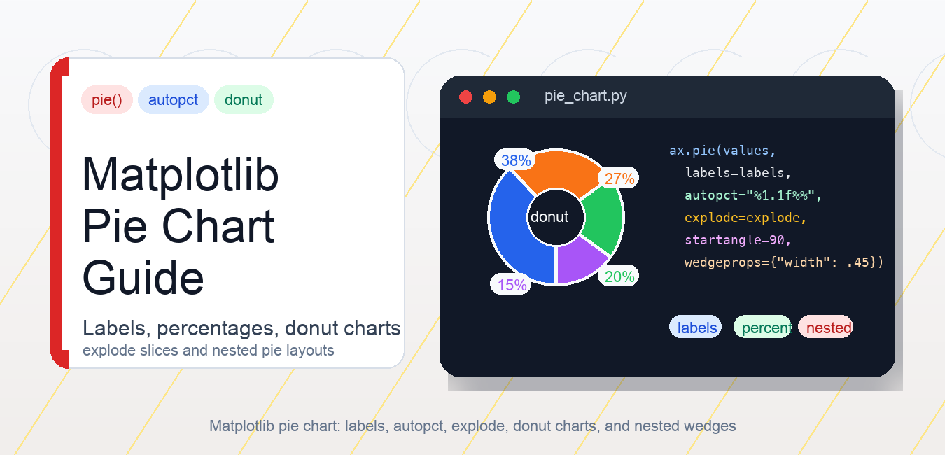
Create readable Matplotlib pie charts with labels, percentages, explode, donut wedges, legends, equal aspect, and better chart alternatives.
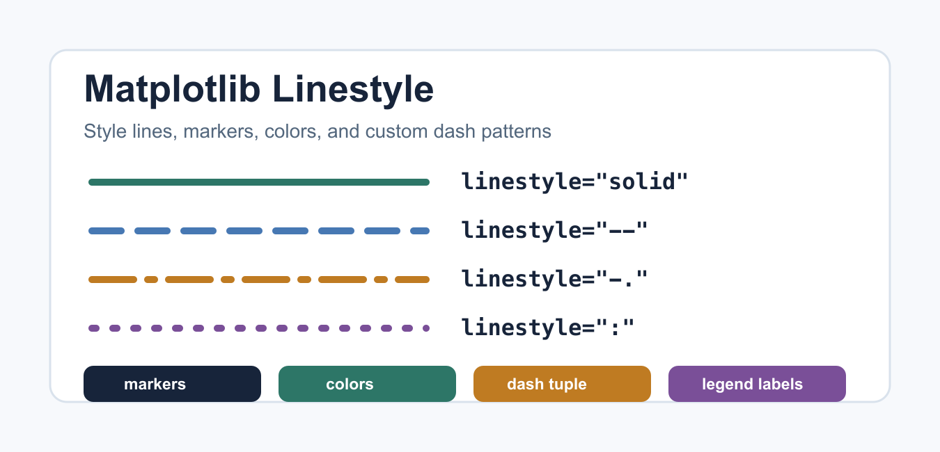
Use Matplotlib line patterns, weight, transparency, color, and markers together so plotted series remain clear after export and printing.
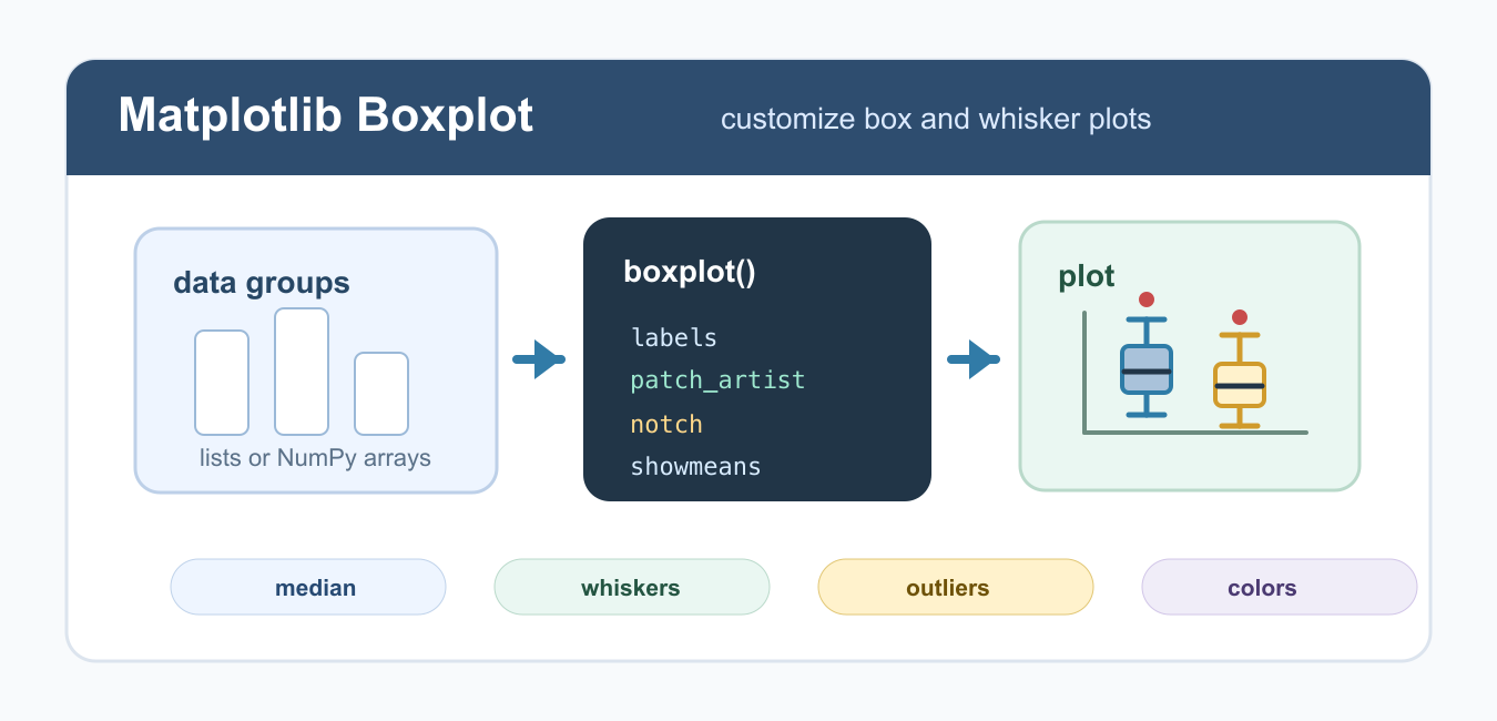
Learn Matplotlib boxplot customization in Python, including labels, colors, notches, horizontal plots, whiskers, outliers, means, and figure sizing.
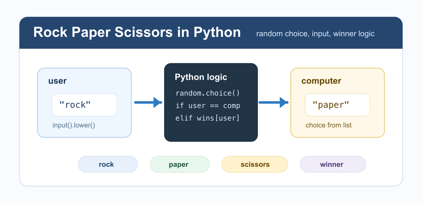
Build Rock Paper Scissors in Python with normalized input, rule mapping, random choice, draw handling, replay flow, and testable game logic.