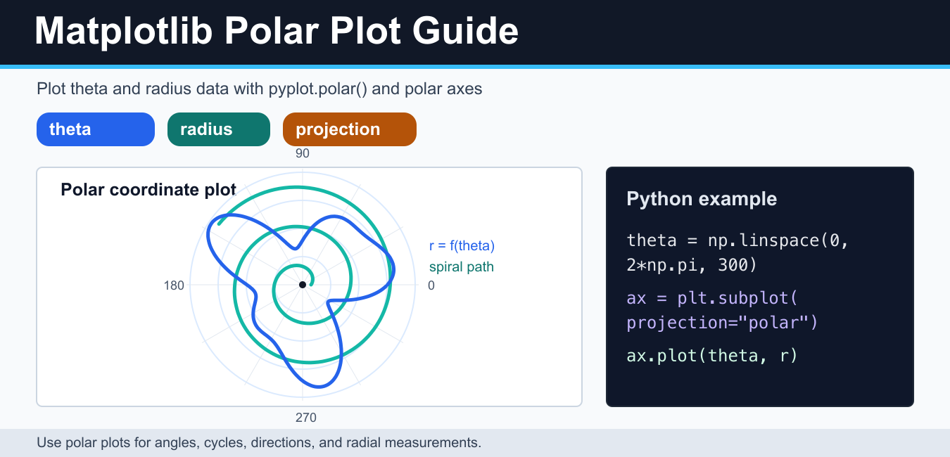
Quick answer: Create a Matplotlib polar chart with an axis using projection=’polar’. Supply theta angles and radial values, convert degrees to radians when necessary, and document the zero-angle location, direction, units, and radial scale so the circular data is not misread.
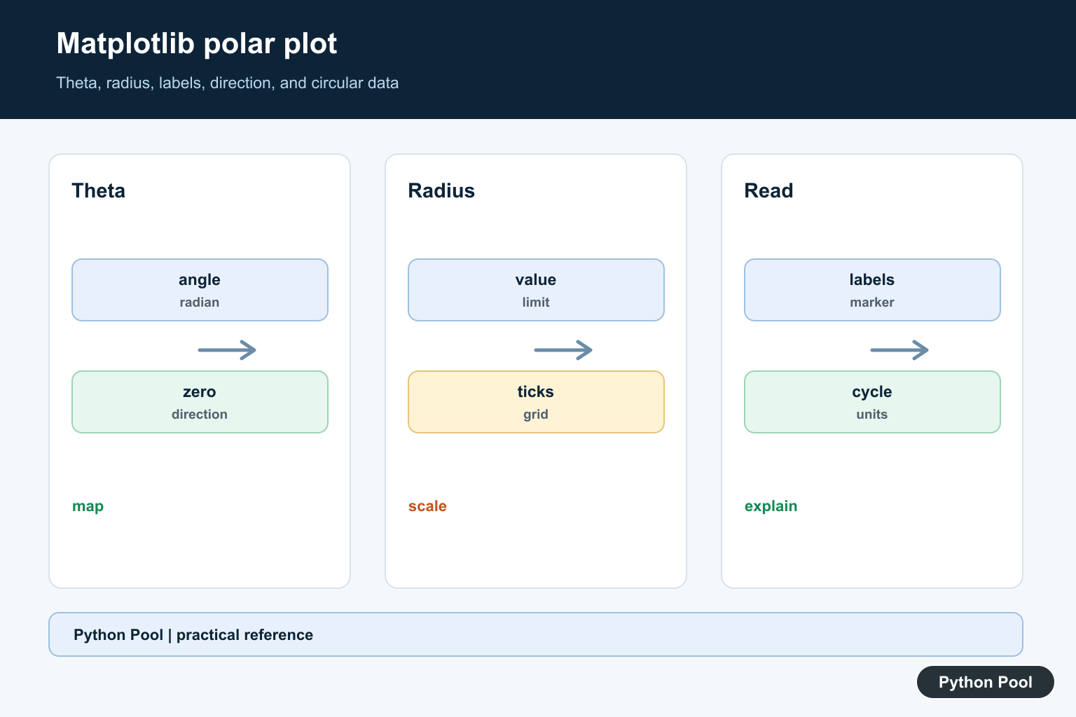
A Matplotlib polar plot shows data in polar coordinates: an angle, usually called theta, and a distance from the center, usually called r or radius. Use polar plots for circular, directional, seasonal, angular, or radial data. Common examples include compass directions, periodic signals, antenna patterns, rose charts, cardioids, spirals, and measurements that naturally wrap around a circle.
Matplotlib gives you two practical ways to draw one. For quick examples, use matplotlib.pyplot.polar(). For real projects, use an axes object with projection="polar". The object-oriented style is easier to customize with grid lines, labels, annotations, colors, and export settings.
Basic pyplot.polar() example
The pyplot.polar() function takes the angle values first and the radius values second. Angles are in radians, so a full circle is 2 * pi. The next example plots a smooth curve around the full polar axis.
import numpy as np
import matplotlib.pyplot as plt

theta = np.linspace(0, 2 * np.pi, 300)
r = 1 + 0.4 * np.sin(3 * theta)

plt.polar(theta, r)
plt.title("Basic Matplotlib polar plot")
plt.show()
This style is compact, but it gives you less structure when the figure grows. If you need multiple plots, custom labels, a saved file, or a consistent style, create a polar axes object instead.
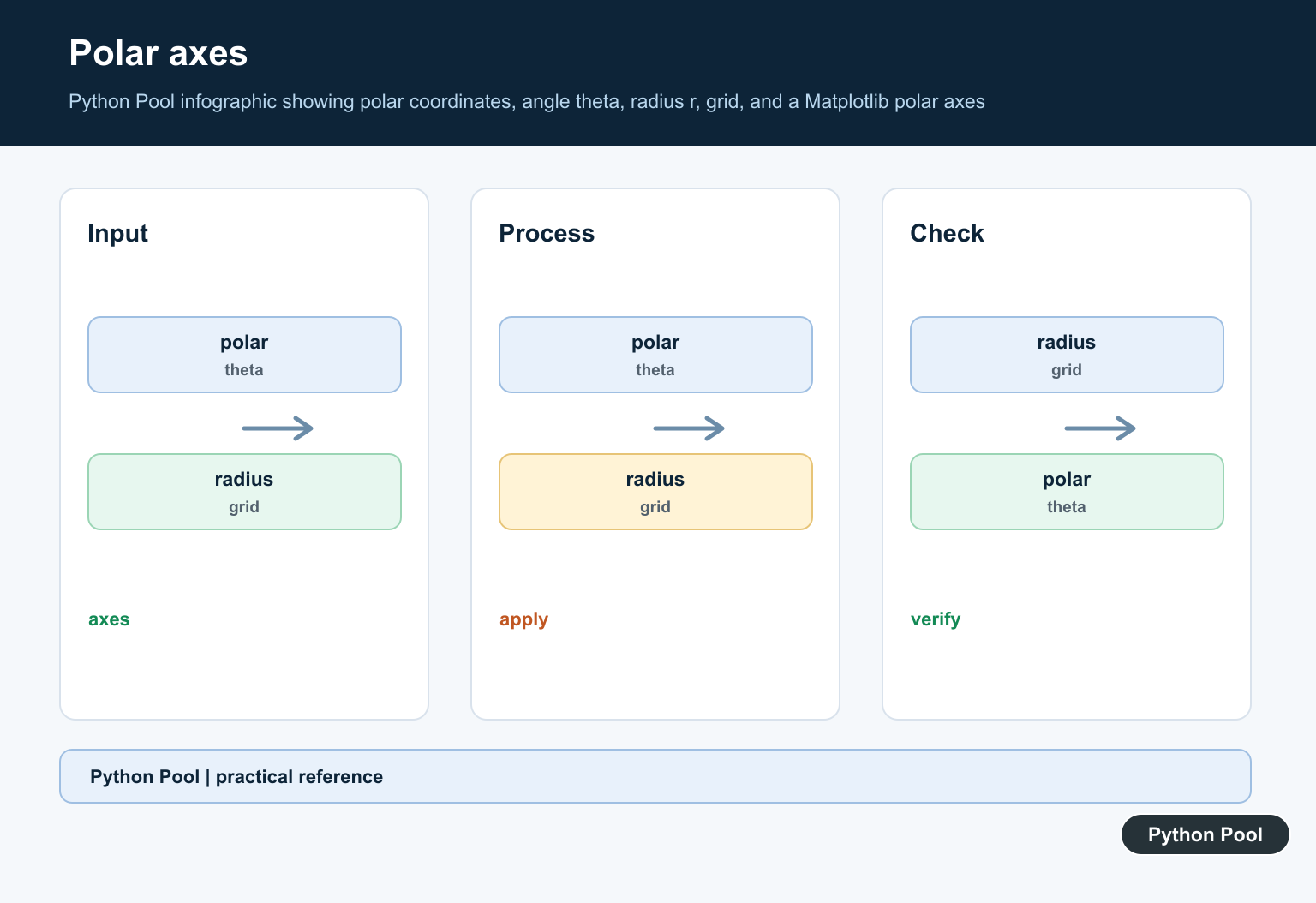
Create a polar axes with projection=”polar”
The most flexible pattern is plt.subplots(subplot_kw={"projection": "polar"}). It returns a normal Matplotlib figure and a polar axes object. You then call ax.plot(), ax.scatter(), ax.grid(), and other axes methods on the polar chart.
import numpy as np
import matplotlib.pyplot as plt

theta = np.linspace(0, 2 * np.pi, 300)
r = 0.5 + np.cos(theta) ** 2

fig, ax = plt.subplots(subplot_kw={"projection": "polar"})
ax.plot(theta, r, color="#2563eb", linewidth=2)
ax.set_title("Polar axes example", va="bottom")
ax.grid(True)
plt.show()
If the grid is visually too strong, tune it instead of removing it. The Matplotlib grid guide covers line styles, alpha, and axis-specific grid settings.
Plot a circle, spiral, and cardioid
Many polar examples are simple formulas. A circle uses a constant radius. An Archimedean spiral increases radius as the angle increases. A cardioid uses a radius based on 1 - cos(theta) or a similar expression. These examples are useful for learning the coordinate system even if your real data comes from a file or sensor.
import numpy as np
import matplotlib.pyplot as plt

theta = np.linspace(0, 2 * np.pi, 400)
circle = np.ones_like(theta)
cardioid = 1 - np.cos(theta)

fig, ax = plt.subplots(subplot_kw={"projection": "polar"})
ax.plot(theta, circle, label="circle")
ax.plot(theta, cardioid, label="cardioid")
ax.legend(loc="upper right", bbox_to_anchor=(1.25, 1.15))
plt.show()
import numpy as np
import matplotlib.pyplot as plt
theta = np.linspace(0, 5 * np.pi, 500)
r = theta / theta.max()
fig, ax = plt.subplots(subplot_kw={"projection": "polar"})
ax.plot(theta, r, color="#0f766e")
ax.set_title("Archimedean spiral", va="bottom")
plt.show()For nearby chart types, see the Matplotlib pie chart guide. Pie charts and polar plots both use circular layouts, but a polar plot is better when the angle and radius both carry information.
Polar scatter plot
A polar axes can also draw scatter points. This is useful when each observation has a direction and magnitude. You can color points by a third variable with a colormap, then add a colorbar to explain the values.
import numpy as np
import matplotlib.pyplot as plt

rng = np.random.default_rng(7)
theta = rng.uniform(0, 2 * np.pi, 80)
r = rng.uniform(0.2, 1.0, 80)
colors = r

fig, ax = plt.subplots(subplot_kw={"projection": "polar"})
points = ax.scatter(theta, r, c=colors, cmap="viridis", alpha=0.8)
fig.colorbar(points, ax=ax, pad=0.1, label="radius")
plt.show()
The Matplotlib colormap guide explains how to choose a readable colormap for numeric values instead of relying on defaults.
Set zero direction and clockwise angles
By default, Matplotlib places zero degrees on the positive x-axis and increases angles counterclockwise. For compass-like plots, you may want zero at the top and angles increasing clockwise. Polar axes support this with set_theta_zero_location() and set_theta_direction().
import numpy as np
import matplotlib.pyplot as plt

theta = np.linspace(0, 2 * np.pi, 12, endpoint=False)
r = np.array([4, 6, 5, 8, 7, 4, 3, 5, 6, 7, 5, 4])

fig, ax = plt.subplots(subplot_kw={"projection": "polar"})
ax.plot(theta, r, marker="o")
ax.set_theta_zero_location("N")
ax.set_theta_direction(-1)
ax.set_rlabel_position(135)
ax.set_title("Compass-style polar plot", va="bottom")
plt.show()
This adjustment matters for wind, direction, route, and bearing data. If you label important points, keep annotations short. The Matplotlib annotate tutorial shows how to add callouts without covering the chart.
Label and save a polar plot
Polar plots can become crowded quickly. Use a clear title, a small number of lines, and labels that explain whether the radius is distance, strength, frequency, percentage, or score. When exporting, use savefig() with a suitable DPI and a tight bounding box.
import numpy as np
import matplotlib.pyplot as plt

theta = np.linspace(0, 2 * np.pi, 300)
r = 1 + 0.25 * np.sin(6 * theta)

fig, ax = plt.subplots(subplot_kw={"projection": "polar"})
ax.plot(theta, r)
ax.set_title("Polar response pattern", va="bottom")
fig.savefig("polar-response.png", dpi=160, bbox_inches="tight")
The Matplotlib savefig guide covers PNG, PDF, SVG, transparency, and common export problems. For multi-panel figures, the Matplotlib subplot spacing guide helps avoid clipped titles and labels. For text-specific layout work, use the Matplotlib text guide.
Common mistakes
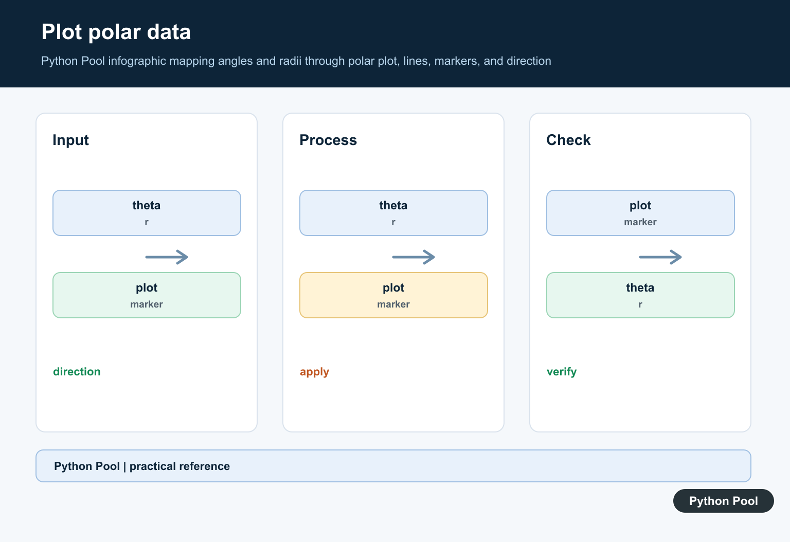
- Using degrees directly: convert degrees with
np.deg2rad()unless your data is already in radians. - Too many lines: polar charts are hard to read when several curves overlap.
- Unlabeled radius: explain what distance from the center means.
- Wrong zero direction: compass-style data often needs zero at north and clockwise angle direction.
- Using polar plots for every cycle: a line chart may be clearer when the wraparound is not important.
When to avoid a polar plot
Polar charts are powerful when the circular structure is meaningful, but they are not a universal replacement for line or bar charts. If the angle is only a category label, a bar chart may be easier to compare. If your main goal is to show change over time, a line chart usually gives readers a clearer sense of trend and scale. Use polar coordinates only when wrapping, direction, or radial distance adds information.
Official Matplotlib references
- matplotlib.pyplot.polar
- Matplotlib polar projection API
- Matplotlib polar demo gallery
- matplotlib.pyplot.subplots
- matplotlib.pyplot.subplot
- matplotlib.pyplot.savefig
Map The Two Coordinates
Theta controls rotation around the origin and radius controls distance from the origin. The plot is not a Cartesian x-y chart with a circular decoration; its coordinate semantics are different.
Convert Angles Explicitly
If source measurements are in degrees, use an explicit conversion such as numpy.deg2rad before plotting. Mixing degree labels with radian values can produce a visually plausible but incorrect chart.
Set Domain Conventions
Use set_theta_zero_location and set_theta_direction when the domain expects north at the top, clockwise movement, or another convention. State the convention in labels or supporting text.
Control Radial Labels
Set radial limits and ticks that make the magnitude readable. Avoid clipping large values or using a baseline that implies a false comparison between areas.
Choose Lines And Markers
Lines communicate a continuous angular series while markers show observations. Avoid excessive fill, overlapping annotations, or too many categories that turn the circular chart into an unreadable color wheel.
Validate With Simple Shapes
Test a constant radius, a single known angle, and a full cycle. Inspect the saved image as well as the interactive figure so the exported layout, legend, and labels remain correct.
The official Matplotlib polar projection reference documents the axis methods. Related Python Pool references include NumPy arrays and testing.
For related plotting workflows, compare array preparation, known-value tests, and measurement diagnostics before interpreting circular data.
Frequently Asked Questions
How do I create a polar plot in Matplotlib?
Create an axis with projection=’polar’, then pass angular values as theta and measurements as radial values to plot or scatter.
Should angles be in degrees or radians?
Matplotlib’s trigonometric conventions use radians for numeric theta values, so convert degree input explicitly when needed.
How do I set the direction of a polar plot?
Use polar-axis methods such as set_theta_zero_location and set_theta_direction to align the chart with the domain’s compass or rotation convention.
How can I make a polar chart readable?
Label the radial quantity, choose a clear theta grid, limit clutter, and verify that the angle convention is explained in the title or annotation.
Thank you for this clear and well structured overview. Most other websites couldn’t explain this well. Even the documention says only plt.polar(**kwargs) so I didn’t know if r or theta is the fist argument.
I’m glad you liked it!
Regards,
Pratik
Great post. What is the vim colorscheme
There is a great guide on Windows official website regarding this colorscheme and how to change it. – Customize your terminal.
Hello,
I’m new to python and you have a interesting blog and I like your explanation. But I have a little question:
Do you know, how to plot a golden spiral?
I think it should be similar to the Archimedean spiral, but I’m to stupid at the moment for that….
Just add a multiplier on line 12
plt.polar().